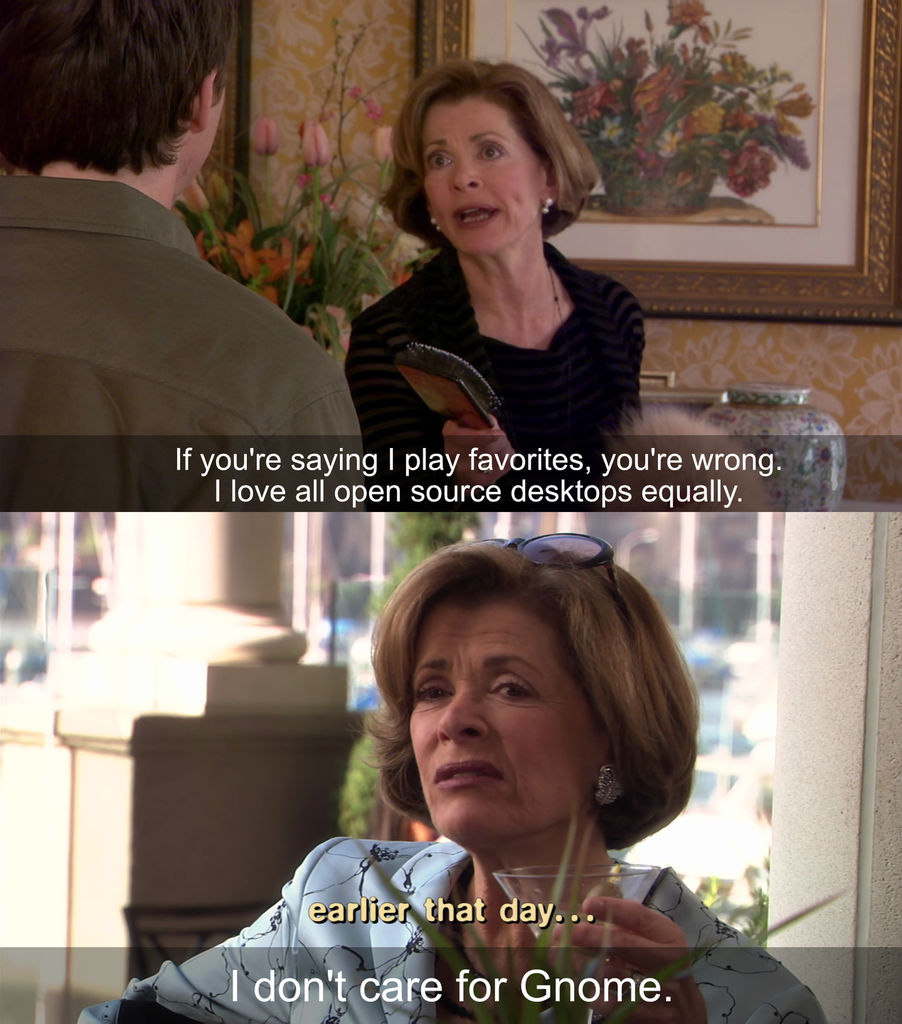
I Don't Care for Gnome
I had to use Gnome the other day and I did not enjoy it. What started out as a few "hmmm, that's kinda weird" misgivings quickly grew into a more powerful "oh, oh no, this is all wrong" terror. Everything felt familiar, but slightly off, like a bad dream.
I found that I could not do tasks that I've been doing for decades, such as moving a dialog window out of the way to see what was underneath, nor could I set my background to plain, solid color to cut down on distractions.
Looking deeper I found that Gnome was composed of so many dreadful decisions and baffling behaviors that I was going to have to write a long-winded article complaining about it all. So read on if you'd like to hear about the many, MANY ways that Gnome is bad, and how to fix it!
Table of Contents
- CHAPTER 1: INTRODUCTION
- CHAPTER 2: DESIGN
- CHAPTER 3: USABILITY
- General Usability Problems
- Usability of the Overview and the Great Black Bar
- Ready for a Deep Dive?
- Deep Dive #1: The Files App
- Deep Dive #2: Text Editor
- Two Special Mentions
- Gnome's Usability: It Bad
- CHAPTER 4: CUSTOMIZATION
- CHAPTER 5: Fixing Gnome
- Special Thanks
- Further Reading
- Changelog
CHAPTER 1: INTRODUCTION
We are now entering…
…the subjective zone! If you like and enjoy Gnome, you will probably not like what you're going to read. You may also want to see a doctor about your head injury. But if it helps you feel better, whenever I say something you disagree with, just think of me as "some pompous know-nothing".
You know what? I don't want you to have to work that hard, so I made a Firefox extension to do it for you. It's even approved by Mozilla! Chrome users can download Firefox here.
Personal Perspective
I have used computers for a very long time: I've used Windows 3.1, Windows 95/98, all the >NT4 Windows, Apple's System 7, MacOS starting on 10.2 I think, and Linuxes like Ubuntu, Raspbian, CentOS, Slackware, Gentoo (for about 3 weeks), and even Linux From Scratch (for about 1 week). I currently use Linux at home for the following reasons:
- I prefer open source software.
- I don't like the direction Microsoft is taking Windows.
- I don't care much for Apple hardware.
- I like to tinker.
- I want control over my computer.
I think that describes the majority of Linux users. So the first time I fired up Fedora, I was shocked at how little control Gnome offered, and how it had combined all the worst parts of Windows 8, Android, and iOS into a system uniquely unsuitable for a desktop computer.
Some Quotes Regarding User Interface Design
Here are what some actual UI design experts have said over the years:
Users feel comfortable in a computer environment that remains understandable and familiar […].
[…] users, because of their widely varying skills and preferences, must be able to customize aspects of the interface.
[…] existing platforms and cultural conventions should be followed across user interfaces.
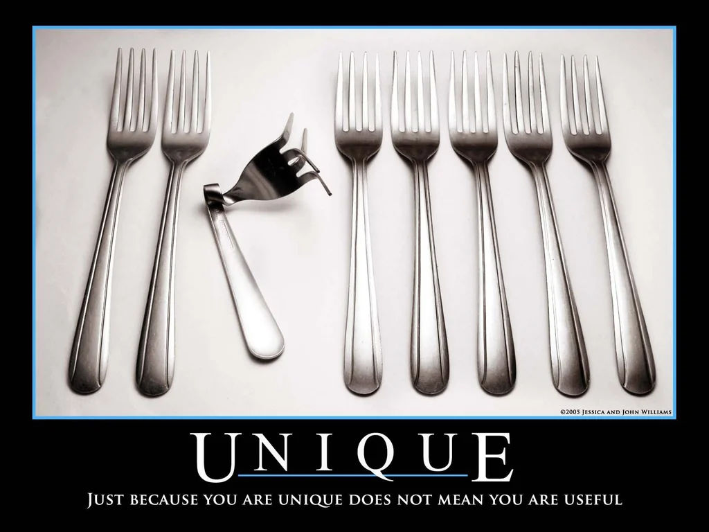
Just because you are unique does not mean you are useful.
The Claims of Gnome
The Gnome home page greets you with this:

Gnome does not have any of these qualities. What it does have is a uniquely unintuitive, unergonomic, and rigid idea of how a computer should work. While people may disagree with specifics, most people would consider the following to be good goals for any interface:
- Discoverability - when presented with a blank screen or a new app, can an inexperienced person figure out what to do?
- Consistency - interfaces that look the same should work the same.
- Clarity - meaning and intent should be conveyed as clearly as possible.
- Flexibility - A good system will let people adapt it to their needs.
Gnome fails at all four of those to varying degrees, and I'm here to show you how much and why it sucks.
Comparisons: Plasma, with a dash of Cinnamon
I'll compare Gnome to my experience with the KDE project's Plasma desktop because that's what I use daily. I will also bring in the Mint project's Cinnamon desktop when I really want to show you the difference between Gnome and good systems. MacOS and Windows will be making appearances because they have set the standards and norms over the last 45 years of graphical computing. Plasma, Cinnamon, MacOS, and Windows have more in common than not, and I'll be showing that Gnome's uniqueness is a detriment to both new and experienced people.
Distro Selection
KDE and Mint provide their own Linux distros so I will be using them to get the full experience. Gnome doesn't have its own distro, so I picked Red Hat's Fedora Linux because Red Hat subsidizes Gnome's development, and Gnome lists Red Hat's Fedora first on their "Get Gnome" page.
The "Get Gnome" Page
For those who care, I'm reviewing:
- Gnome v46
- Plasma v6.1
- Cinnamon vWhatever ships with the Mint I downloaded in late May 2024.
A few notes:
- I will not use command lines or edit config files for any of this because these are supposed to be user friendly graphical systems that can replace Windows. For all of Windows' faults I can only think of a single option that requires me to use the Registry Editor (it's turning caps lock into another control key).
- I will not be comparing the performance of these desktops because I'm running them in virtual machines.
- If any of my issues were addressed while writing this or afterwards, I don't care. They were issues when I started.
- I'm going to be starting from default configs so I can judge the vanilla experience.
CHAPTER 2: DESIGN
This section will go over the various aspects of Gnome's user interface design, and explain how each contributes to the overall mess. Whenever appropriate I'll show how Plasma does similar things, but good.
Gnome's Two Cardinal Sins
Gnome commits two cardinal sins. Do you know what the difference is between a regular sin and a cardinal sin? Not even God can forgive cardinal sins.
Sin 1: Ignoring the Past
[...] if you talk to the users of the systems, most of them are primarily concerned that what used to work continues to work and in the same way.
- Alan Cox
Gnome made the bold choice of throwing out many common GUI conventions and metaphors. The layouts of its desktop, launcher, and core apps are radically different from everyday designs such as Plasma, Windows, and MacOS. A radically different design might be fun to make, but it hurts usability because people have to learn a new, not necessarily better, way of doing things.
People aren't using computers to use computers, they're using them to complete tasks. People invest time and energy into learning and perfecting their workflows. If you change the way people do their tasks, they rightfully get upset. Gnome even sabotages its own users; over time it has removed features from its own apps, completely disregarding how people were already using them. We'll cover an example of this in Chapter 3.
Sin 2: Pretending Your Desktop is a Phone
Gnome has stated that it wants to work on a variety of form factors. This is a stupid idea because there are fundamental differences between a 5 inch phone with a touchscreen and a 30 inch monitor with a mouse and keyboard. Mouse and keyboard interfaces don't work well on a touch screen (especially small ones), and touch screen stuff is inefficient and visually gigantic on a regular computer. Microsoft spent millions learning this lesson when everyone hated Windows 8. Apple, the masters of UI, have wisely not forced the iPhone interface into MacOS.
And Gnome doesn't do a particularly good job of acting like a phone/tablet anyway. In particular, many common tablet/phone idioms don't work. Gnome doesn't work like my iPhone OR my Kindle Fire tablet. Gnome's weird goal of making a desktop that's everything to everyone has turned into a pile of compromises that doesn't work well for anyone.
Gnome's Recommendations
There is something called the Gnome Interface Recommendations (GIR). This is the source of most of the bad design you'll see later. Here are some quotes from the recommendations:
[...] we seek to be as inclusive as possible. This means accommodating different physical abilities, cultures, and device form factors. [emphasis mine]
Microsoft has shown us that you cannot accommodate multiple device form factors with the same system unless you are willing to handicap every form factor.
The best apps do one thing and do it well.
This is a trite idea with no real bearing on design. Plus, it's wrong! The best apps enable people to get their work done in the quickest and most efficient manner. The best apps are friendly to beginners, and are flexible enough to let experience people build their own workflows.
Frequently used actions should be close at hand, with less important actions being further away. [...] Try to minimize the number of steps required to perform a task.
This is a good idea, but Gnome doesn't do it so I don't know why they mention it. Don't worry, there will be examples later.
The Tour App: A Good Example of Bad Design
Let's take a moment to do a quick comparison. We'll start at the very beginning - the first time you log in to Plasma and Gnome.
Up First: KDE Plasma
KDE Plasma gives you a few screens to get acquainted with its features.
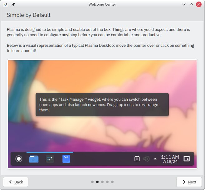
KDE is assuming you've used a computer before. It isn't asking you anything beyond knowing how to click a mouse. Screen-by-screen breakdown:
- Screen #1: Opening blurb about what KDE Plasma is.
- #2: Reassures the user that "things are where you'd expect", while also providing a small, interactive version of the Plasma taskbar to play with.
- #3: Shows off some of the features that people won't know about if it's their first time using Plasma. A key item here is a button to launch the Settings app so you can poke around.
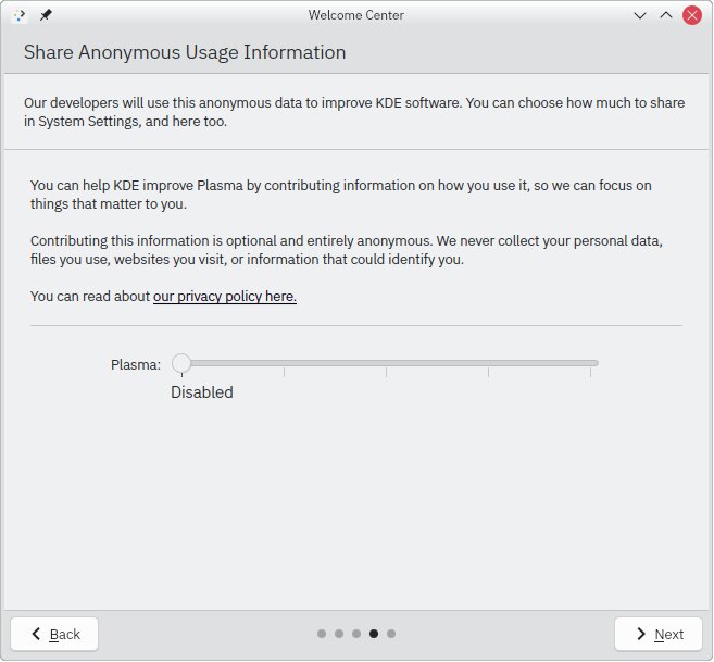
- #4: Allows you to opt-in to telemetry, with the sensible default of it being disabled.
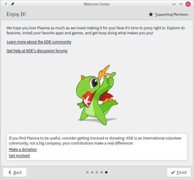
- #5: Concluding screen that provides links to the help menu, and a welcoming message to get involved: "your contributions make a real difference!"
Gnome's Tour
The first time I logged into Fedora I was asked to go through a tour. I can understand the need for a tour because I soon realized it isn't anything like what I'm used to (this is bad, btw). Let's start at the second screen (the first is just a welcome message).
Screen 2
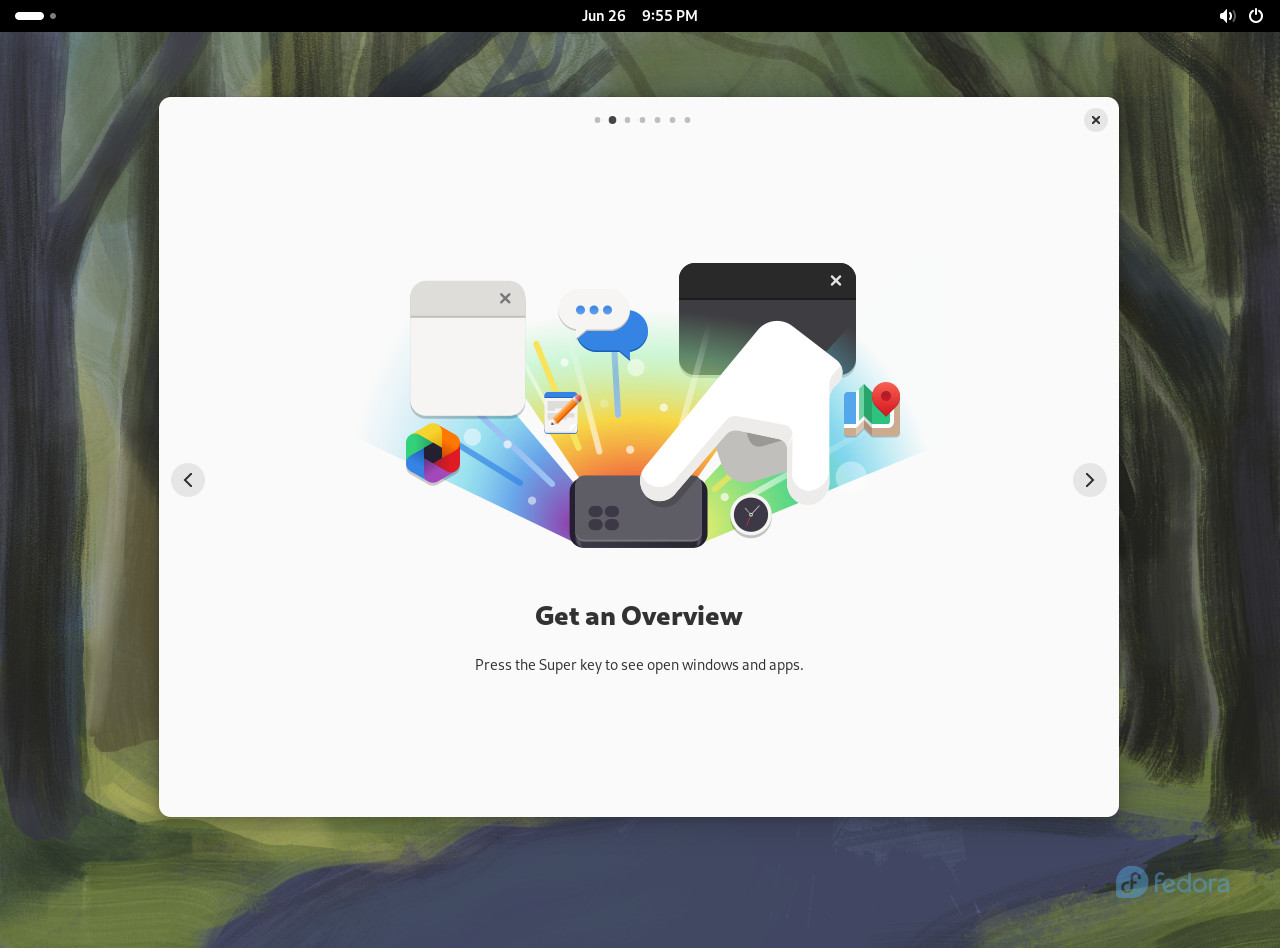
We're instructed to "press the Super key".
- My keyboard does not have a key labeled "Super", and unless you're using a Space-cadet keyboard on a LISP machine from 1978, neither does yours.
- If you run this on a tablet without a keyboard, this screen still shows up. (I tested this, and now I have to reinstall Windows onto a Dell tablet I don't even like. Thanks, Gnome!)
Screen 3
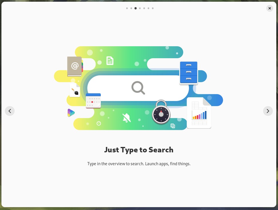
- It should remind you that you need to hit super again to try this out, because typing right here does nothing. It's not very interactive.
- You cannot try this out on a tablet because it hasn't told us how to get there without the Super key.
Screen 4
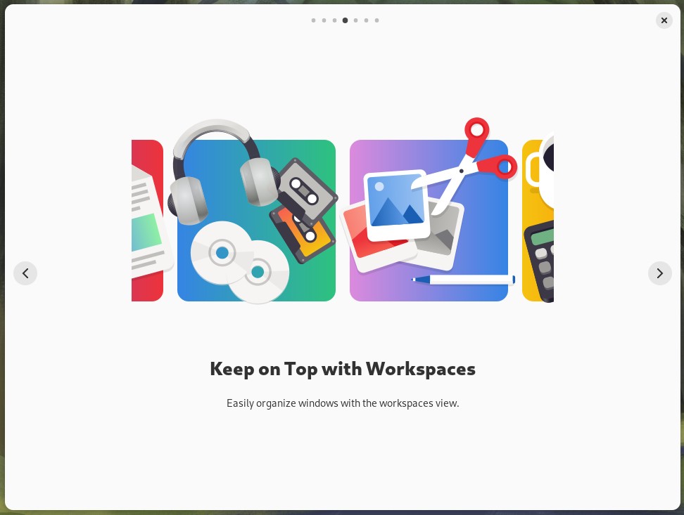
Man this screen sucks:
- What is a workspace? When I hit the Microsoft key there's nothing labeled workspace.
- The illustration really isn't helping and feels like filler. Am I supposed to have a workspace for listening to cassettes and CDs?
- How about an animation showing how to use workspaces? The next screen has animation, why can't this one?
Screen 5 (and 6)
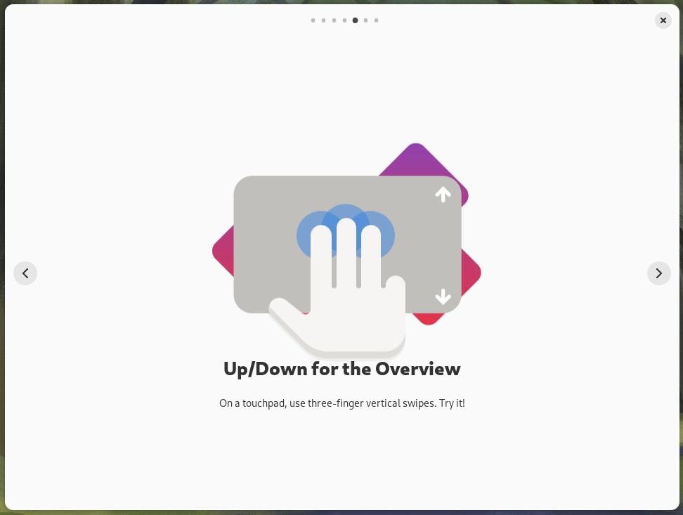
I can't even with this screen. What am I supposed to try?! My computer doesn't have a touchpad, and neither does my tablet. This screen is subconsciously demonstrating that Linux sucks because it can't even figure out if there's a touchpad, a mouse, or a touch screen connected. The sixth screen is the same but for left/right gestures, so I'm skipping over to the final screen.
Screen 7
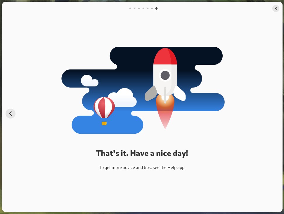
How could I find anything wrong with this page? Easily:
- Lacks interactivity: Why isn't the "see the Help app" a button or link I can click on to go right there?
- Missed Teaching Opportunity: You have the opportunity here to prompt the user to get involved with the process: "Want more tips and advice? Try hitting the super key and typing Help to launch the Help app".
- How to Leave? Plasma's Welcome app had an obvious "Finish" button, but Gnome offers no such convenience. Do I really have to click the tiny close button to start using my computer?
- Disregards Mouse Users: We've come to the end of the tour and they haven't explained how to use a mouse to get to the overview.
The Tour, literally the first app you run, shows how Gnome's two major failings ruin things for both new and experienced people. New people will be wondering how to use the mouse to open the overview and what a workspace is, and experienced people will be wondering why they have to learn something new for no readily apparent benefit (and also what a workspace is). Gnome doesn't work enough like a tablet to be friendly to iPad-havers, and it's different enough from Plasma, Windows, and Mac to make it annoying to have to relearn where things are and how they interact.
And let me tell you a secret about "new people": there are no new people who need to be onboarded onto Linux because nobody's grandma is going to Best Buy to buy a Gnome tablet. The onboarding is only required because Gnome's interface is unique. Uniquely BAD.
Gnome's Wannabe Phone Interface
Gnome's attempt to work on many different devices is completely misguided and a failure to understand that phones are not desktops. Again, we can thank Microsoft for teaching us that tablet interfaces suck for normal computers. I don't want to speculate why Gnome thinks people want this when it's obviously a bad idea, so instead I'll go over the things they've stolen from phones and show why they're bad.
- The Great Black Bar: Gnome has a nearly empty horizontal bar of black at the top of the screen, mimicking a smartphone's clock / status area but without the features.
- Lists of Texts: Gnome loves long lists of text for things like preference dialogs and tools. The lists take up too much screen real estate and don't do anything useful with the wasted space.
- Mysterious Menus: Gnome has ditched concepts like clarity and discoverability for a one-size-fits all burger menu. Did you know that on the iPhone, not a single Apple-provided, default-installed app has a burger menu as a "main menu" like Gnome does?
- Inconsistent Behavior: Even when supporting touchscreens, Gnome doesn't work like iPhones or Androids. This increases friction and forces people to learn a bunch otherwise inapplicable interactions.
The Great Black Bar
Gnome takes up the top of your screen with a space-wasting black void. Here is a screenshot of the Great Black Bar on my 34" inch monitor. It contains 3 user interface elements and is 2,560 pixels wide.

Wait! You know what's better? A screenshot of the bar on a colleague's 50" screen!

According to the manufacturer's spec sheets, the 50" monitor's is 47 inches wide, so there's almost 2 feet between the elements of the top bar. What is the point of wasting all this space? Why can't all the elements be grouped on one side or the other? I can't show you the equivalent on Plasma or Cinnamon because they wisely decided not to waste the top of your screen.
If this is supposed to mimic MacOS, it's a total failure. Apple populates their top bar with useful tools and menus. My iPhone's tiny little bar packs more utility into its 2 inches than Gnome's screen-spanning void.
Lists of Text
The core Gnome apps LOVE iPhone-style lists like these:
This isn't elegant, it's just boring. It's a bad use of screen space: the interface elements are gigantic because they're needlessly aping an iPhone experience. There is nothing graphical going on here. There are no icons to draw the eye, instead it's just a plain list that extends vertically.
The text editor example is especially bad. The window is about 500 pixels tall, nearly half the height of a 1080p screen. For what? To show 6 pieces of information that could easily fit in a status bar, or be a sidebar in the editor's main window.
The file manager's preferences are just text item after text item. They take up so much room you can't even fit all THIRTEEN options on a 1080p screen:
Gnome Menus: Bad for Recall and Clarity
Gnome apps eschew easy-to-comprehend text menus and instead use a variety of seemingly random icons. To wit, the file manager:

Here's a challenge: which of these menus hold the cut/copy/paste actions? Stay tuned, I'll tell you later in Chapter 3! Having a bunch of random icons hurts people's abilities to recall where options are located. Requiring a user to hover over an icon to see the menu's name slows things down.
Touch Screen Behavior Is Inconsistent
For a second, let's pretend that making a one-size-fits-all interface is a good idea. I installed Fedora on a Dell Tablet computer that has no keyboard. And you know what? IT SUCKED. Gnome ignores the history and conventions of touch screen systems (iPhone and Android) and for some reason rips off MacBooks:
- Instead of swiping up from the bottom to go "home" to the overview, you have to three finger swipe. This isn't a MacBook Air, it isn't Windows 11, make it work like an iPad please!
- Once you're in the overview, does a simple left or right swipe switch to a different virtual desktop? No, but it should! For some reason you have to three finger swipe left and right.
- Swiping down through the Great Black Bar does nothing. Come on, this is one of the most basic interactions possible.
On touch screens you have a limited amount of inputs, and Gnome isn't even fully using the ones you have. But I guess it's okay to have poor tablet support, because no one's going to use it anyway.
The Design is an Anchor Dragging Gnome Down
So we have these design elements that throw out user expectations in favor of a vague idea called elegance, but it just results in a hybrid desktop/phone interface that has none of the positives of either but all of the negatives of both. In the next chapter, I'll explore how these guidelines kill Gnome's usability.
CHAPTER 3: USABILITY
Usability is a massive topic that people have been writing about and researching for decades. I presume Gnome either never read any of it or ignored all of it, because instead of discoverable, consistent, clear, and flexible, Gnome is:
- Inconsistent: Gnome's insistence on having a unique interface requires people to spend time learning the interface when all they want to do is get work done in a predictable way.
- Unclear: Gnome uses generic icons and menus that have no concrete meaning. It is up to the user to memorize what commands are hiding behind what icon.
- Inefficient: Gnome hides common actions and requires multiple steps where one (or none) would suffice.
- Inflexible: Gnome apps do not even entertain the idea of custom toolbars, and the Gnome "shell" is actively hostile to customization.
In this chapter I am going to show many of the ways that Gnome is inconsistent, unclear, inefficient, and inflexible. I'll cover issues that apply to Gnome as a whole, then hit some specific examples to showcase how poorly thought out everything is.
Quick note about consistency: When I'm talking about inconsistency, I'm talking about how Gnome doesn't work like other systems ("external consistency"), which requires relearning/wasting time. Generally, Gnome is pretty consistent among its own apps ("internal consistency").
General Usability Problems
I'm going to start by talking about the general problems that stem mostly from Gnome's cardinal sins (ignoring the past and trying to make a universal interface). The usability issues extend to poor window handling ergonomics, menus that make things less efficient, ridiculous search results, and an allergy to using graphics that could help people understand their options.
Baffling Window Handling
Gnome's window handling is one of the two things that got me started writing all these words (the other - background options - will be covered in the next chapter). Almost every window handling decision was wrong.
Missing Min/Max Buttons
Gnome has no maximize (enlarge) or minimize (hide) buttons in its windows, which hurts discoverability AND efficiency. Is anyone else using this bold, unique approach? I made a table so we can do a stare-and-compare.
| System | Min Button | Max Button | Market share |
| Windows | ✔️ | ✔️ | 73% |
| MacOS | ✔️ | ✔️ | 15% |
| ChromeOS | ✔️ | ✔️ | 2% |
| Linux: Plasma / Cinnamon / Xfce / LXQt | ✔️ | ✔️ | *2% |
| Linux: Gnome 46 | ❌ | ❌ | *2% |
*Note: if certain stats are accurate, Gnome is about 50% of graphical Linux installs , so if Linux has 4% desktop market share, it's fair to say that Gnome has a 2% share. I can't remember where I saw that 50% stat, sorry!
Hmm. Looks like Gnome is pretty unique here! The total number of desktop operating systems with min/max window buttons is at least 92%. Could there be reasons for that? Yes, it's discoverability and efficiency. Discoverability means that if you put visible buttons on your windows, people will first SEE the buttons and then LEARN, on their own, what those buttons do.
Efficiency comes from having an always-visible target for manipulating a window makes it easier to interact with that window. Gnome's design hurts efficiency. If you have three windows open, all of them slightly overlapping, and you want to hide the topmost window, how many clicks does it take to hide the window? On Plasma, Windows, and MacOS this is a single click. Gnome requires you to right-click the title bar and select Hide.
Double-click to Maximize: Challenge Mode
Instead of having an easily noticed and clicked maximize button, Gnome provides two ways to maximize a window. The first is the awkward method of grabbing the title bar and dragging it up to the top of the screen. Gnome also wisely stole Microsoft's "double-click title bar to maximize" feature. Everyone stole it, it's a good idea! If you're already hovering over the title bar, then you can quickly maximize the window with a simple double-click. This is much quicker than the "drag the window to the top" thing.
But Gnome stole it without understanding why it works so well, and it's terrible because they crammed the title bars full of widgets, so now you have to hunt for clickable areas. The highlighted areas are where you can double-click to maximize:
This hunting for a double-clickable area could be completely removed if they just added a maximize button.
Oh, the pink highlights? Those are a different color because they can be double-clicked to maximize if those buttons are grayed out. But if the "back" button is enabled, it can't be used for maximizing. But you can never double-click the URL bar because this puts it into edit mode. It's inconsistent and it makes my head hurt.
Bad Support for Quick Resizing
Quick resizing is a de-facto standard feature of Linux GUIs. Quick resizing is when you hold down a modifier key like Super or Alt with the right mouse button and drag to resize the window. This is convenient because you don't have to worry about where a window's borders are, you can just click anywhere in the window to resize.
Gnome implemented it differently from most other GUIs: they make you middle click to activate it. This is a problem because:
- It's not consistent with how Plasma, Xfce, IceWM, Fluxbox, etc. behave.
- My laptop doesn't have a middle button, neither does my travel mouse. How am I supposed to use this feature?
Gnome also doesn't support quickly maximizing a window vertically like Plasma or Windows does. In Plasma, middle-clicking the maximize button will make the window only expand vertically. In Windows you get the same effect by double-clicking a window's edge. Gnome just doesn't include this convenience. Why make it more difficult for people to vertically maximize a window?
Child Window Behavior is Incomprehensible
Gnome has made two really unique decisions when it comes to child windows (a.k.a. dialog boxes). Moving a child also moves the parent, and the resizing behavior is so bizarre that I had to record it to show you what I mean.
Moving The Parent: Ever since Windows 3.1, programs have been able to show child windows. The child windows can be moved around the screen so that you can still see the parent window. Plasma of course gets this right and lets you freely move child windows around, independent of the parent. I mean, who would do anything different?
I wanted to take a screenshot of Gnome's software updater next to its "About" box, and I was quite surprised when I dragged the About box and this happened:
I'm not sure I've ever seen a graphical system do this. What on earth is the rationale? Please don't actually tell me because any explanation will be stupid. Here's what happens in Windows 3.1:
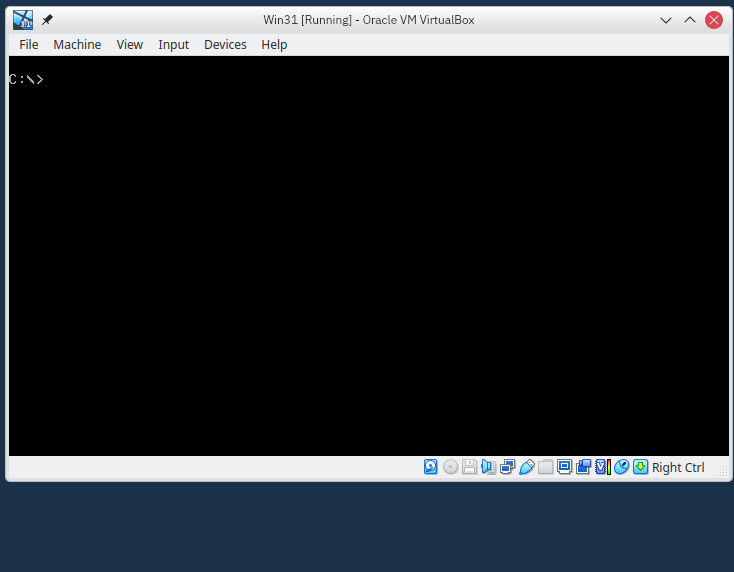
Do you see how back in 1992 we could move child windows independently from the parent window? Amazing! Gnome has an another surprise for you: if your app is maximized and you try moving the child window out of the way to see something, your entire app gets un-maximized:
So you can't move a dialog box out of the way of your maximized window? This is a bafflingly bad behavior.
Unexpected Resizing Behavior: Words cannot explain this so watch this video.
I thought my annoyance had peaked at the "child-moves-the-parent" thing, but then I accidentally discovered this stupid misfeature and realized how much madder I could get. I want to make the window taller by dragging it down - I only want it to expand from the bottom.
You know why else it sucks? I hate editing videos, and as soon as I saw this, I realized I was going to have to edit another one.
The Final Window Management Insult: Firefox
I love Firefox. I don't like that Firefox uses Gnome's widget toolkit, called GTK, for its Linux version. If you want to hide Firefox and right-click the title bar, look what happens:
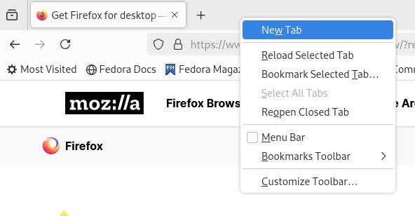
So how do you hide the window? Just double-right-click the title bar, idiot! So... does Firefox have to maintain code to implement this workaround for Gnome's terrible window management? It could be completely avoided by adding a minimize button or a regular title bar like all other desktops. When Firefox is full of tabs, there's only a tiny bit of space left over to access the Gnome window menu. Plasma, Windows, and Mac don't have this problem because they all have min/max buttons.
Gnome Menus - Inefficient and Unclear By Design
[…] Because they list all available activities, menus let users quickly get an overview (or, for
new users, a preview) of what is possible at any given moment. […][…] The most frequently used operations should be at the top of a menu. The least
frequently used (such as Quit) should be at the bottom.The Apple Human Interface Guidelines, 1987
Avoid using a pop-up menu as the exclusive means to a particular operation
Windows Interface Guidelines, 1995
The menus in Gnome are, like the rest of Gnome, uniquely bad:
- Mystery icons that are bad for clarity and recall.
- Inconsistent "burger" menu placement.
- Submenus replace their parents, decreasing efficiency.
- Holding ALT key doesn't show menu shortcuts (except when it does!)
Mysterious Icons
For all its claims of elegance, Gnome has very basic graphic design, which it papers over by using a bunch of generic monochrome icons that don't indicate what they do. Some examples of this are Text Editor's and File Manager's menus.
Text Editor Menus

The two menus on the right are the... wrench menu? and the burger menu. The only menu with a clearly-defined purpose is the "Open" menu. It accomplishes this clarity using "words". It's so simple and understandable that I'm surprised it was allowed in a Gnome app at all. And the plus sign next to the open menu? That's not a menu, that's a button, but I understand that no one would be able to tell that just from looking.
The "Open" and the wrench menu are what the GIR call "secondary" menus. In their own words:
Secondary menus are located in the header bar, and are used to contain actions and settings for a particular view or content item (such as a document, contact, conversation or photo). This differentiates them from primary menus, whose menu items relate to the entire app.
However, that wrench menu is full of options that do NOT pertain to the open document. Every option in that menu affects the entire app. And these are options not found in the preferences screen, so this menu is basically a second set of preferences. And the Zoom options, which you would think count as View options, are in the burger menu, BUT only pertain to the current document. Did someone forget to read the GIR?
File Manager Menus
I'm going to go more deeply into File Manager's deficiencies later, suffice for now that there is a 3-line menu, a 3-dot menu, and a 3-checklist-looking-thing menu. What do they do? Who knows!?
Inconsistent Placement
Looking at the Files app versus the Text Editor app, why is the burger on the left instead of the right? Gnome isn't consistent at all about placement of anything in the title bar:
When your Grandma calls you to ask "where's the cheeseburger menu in that tablet you bought me at Family Dollar?" simply remind her that if the app has hierarchical navigation or a side bar it SHOULD (but won't always) be on the left, and if it's a single-view-at-a-time app that it will probably be on the right. Easy peasy.
Submenus Replace Their Parents
Gnome doesn't want apps to have submenus, and to prod people into removing them they have made the submenu interaction painful for mouse users. If you thought "hey I know, what if opening a submenu made the parent disappear, and also made the user click a target really far away?" then you have a bright future in Gnome development ahead of you. I present you this GIF:
I have prepared a list about why this is bad:
- The submenu makes the original menu disappear, so to go back a level you have to click a back button. This is inefficient.
- Hiding the original menu makes you lose your place. This makes it more difficult to remember where things were visually. Apple calls this "recall" in their interface guidelines.
- This design prevents quickly scanning through submenu options. This is unfriendly and makes learning take longer.
- The submenu appears at the parent's original location, making the user needlessly travel further to get to the submenu. So even if the most common action of the submenu is at the top, like good design dictates, then that action is now the furthest from my mouse cursor.
The submenu design baffles me. I am baffled. As Gnome's GIR states, "try to minimize the number of steps required to perform a task." This menu design flies in the face of this advice. You can't even browse through menu options without multiple clicks! It's terrible for discovery.
Inconsistent Alt Key Behavior
From the GIR's keyboard section:
Access keys allow someone to operate labeled controls by holding Alt in combination with another key. These are indicated by an underlined letter within each control label (this is displayed when Alt is held down)
In the following GIF, you'll see that the Alt access key works fine for the Open menu in the title bar, but doesn't work at all in the menus.
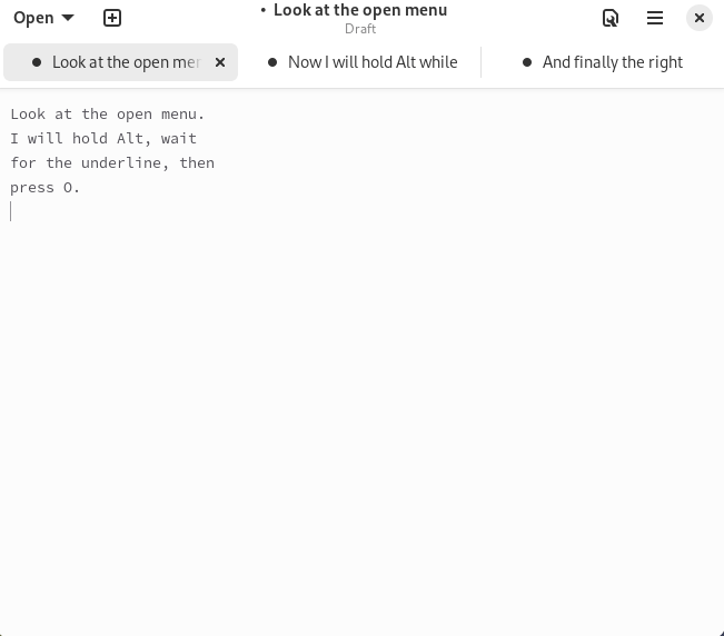
I don't know if this is a bug or not, but it seems like Gnome is ignoring a basic accessibility feature that can speed up certain workflows.
Menu Conclusion: THEY SUCK
Menus have been a solved problem since the 1980s when Apple published their UI guidelines. The only reason to not follow their lead is if you thought you could make an interface work for both phones and 50 inch monitors. You can't. But you can make weird, non-standard menus that don't work very well!
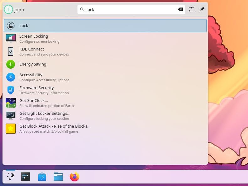
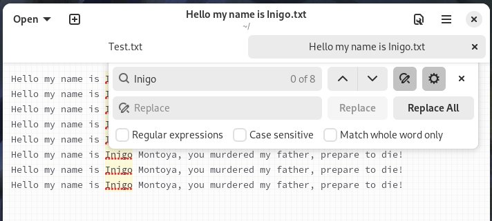
Search is Bad
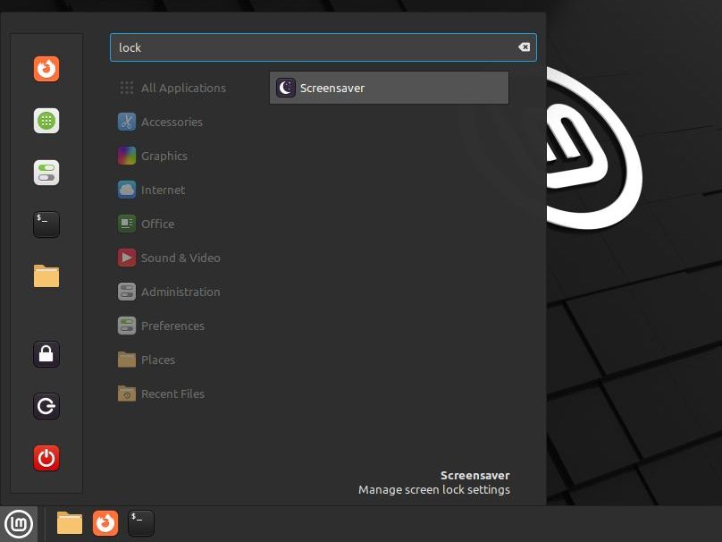
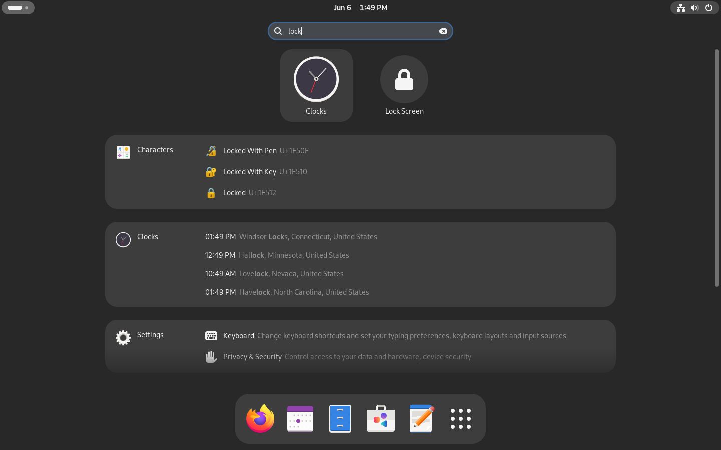
The virtual machines I'm using for this review were going to sit idle while I write so I wanted to turn off screen locking. It's annoying to have to enter a password all the time. Plasma, Cinnamon, and Gnome have Windows-style Start menu search, so let's see how they do. I will type the word "lock" into their respective Start menus and see what happens.
Plasma & Cinnamon
The top two results are:
- Lock: Locks the screen immediately. A good result.
- Screen Locking: the control panel that lets you change how screen locking works. Good work, Plasma!
Mint's search result is perfect: a direct link to the settings page AND a tooltip saying "Manage screen lock settings".
Gnome's Search Results
The good: A button to lock the screen shows up, BUT that's not the option I want so let's talk about the bad:
- A list of padlock emojis, which isn't anything close to what I want.
- A list of clocks, which also isn't helpful.
- The setting I want is the ninth option down. Why does "Keyboard" even show up? Caps lock?
Why are emojis and clocks given priority over the control panel items? Am I going to get emoji results whenever I search for anything? Originally, I only wanted to find the lock screen options; I had no intention of writing up the search system until I realized it gives spectacularly bad results, even worse than Windows.
Gnome: The Non-graphical GUI
As you can see in most of my screenshots, Gnome's widgets take up a lot of screen space. Do they do anything useful with that space? Not really, no. You could use the pixels on a screen to convey ideas graphically (efficient), or you could go the Gnome route and show one boring line of text after another. Let's look some examples.
Display Settings Showdown
Here is Plasma's display settings screen.
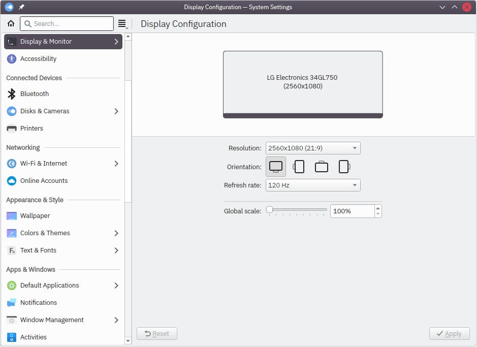
It's good! It has a graphic of a monitor, and some common options. Let's look at Gnome.
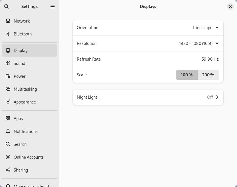
Look at the options for screen orientation. Well, you can't see it because it's hidden behind a dropdown menu, so it takes an extra click to get there (inefficient!). Lemme click it and show you:
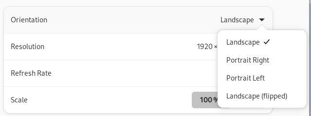
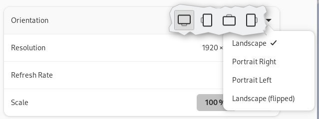
I'm unsure how to relate "Portrait Right" and "Portrait Left" to the physical world. Does "Right" mean the connectors are on the right, or the monitor? Compare that to Plasma's simple graphics that make orientation obvious. Gnome's is a text-based waste of space. I've superimposed Plasma's onto Gnome's so you can compare:
Would it surprise you to learn that if you hook up a second monitor, Gnome is going to make you go to a sub screen to change each monitors' settings?
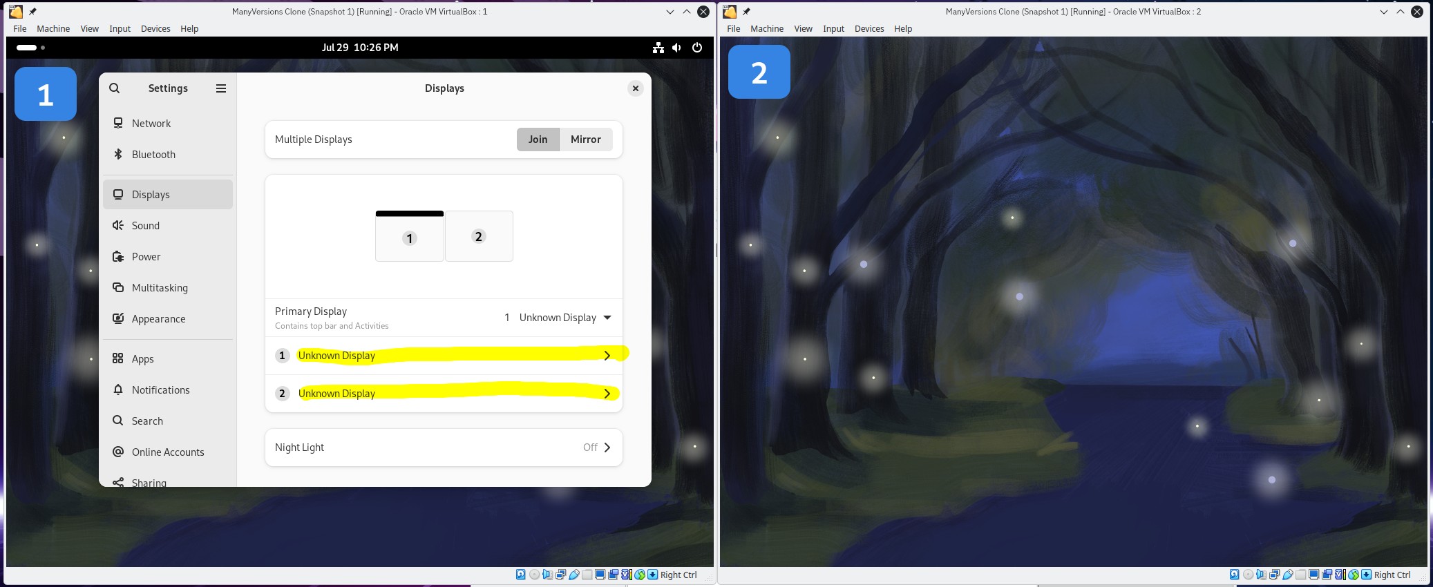
Instead of clicking on each monitor's rectangle and changing settings, you have to read the list-of-text, match the number up to the number in the rectangle above, and click it. The plasma version is also better because it's stable - it doesn't radically change based on how many screens you have. Gnome's is basically an entirely different interface.
Menu Icons? No thank you!
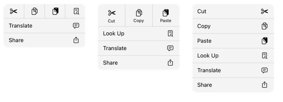
I've got another example of failing to use graphics. I borrowed this image from Apple's human interface guidelines for iPad (which as I understand has a touch interface, the kind that Gnome claims to be):
Usability of the Overview and the Great Black Bar
The void of the black bar and the full screen of the Overview are a wonderful confluence of bad design.
- Overview takes up the full screen.
- Task management requires extra step to display.
- Mouse use takes too much travel.
- System tray is hidden behind multiple clicks.
A Full-Screen Launcher
The Overview takes up the full screen, much like MacOS' Mission Control view. The main difference between the Overview and Mission Control is that Mission Control is entirely optional. What do I mean? I mean that MacOS provides you with an always-visible taskbar at the bottom of the screen. I have never purposely used Mission Control, and I don't have to! I can always see everything I need at a glance on MacOS, I don't have to open an entirely different view to do things like running apps or launching apps.
Gnome is again copying Windows 8, but worse. At least Windows 8 had a taskbar. Even Windows 11, with its three finger gesture to show open apps, doesn't REQUIRE you to do so for app launching and task management. Gnome is the only desktop system I know of that makes you switch to a completely different screen just to manage apps.
Overview Travel Distance
Gnome is unsuitable for any computer, but is particularly bad for mouse users with wide screens. My screen is a 34 inch, 21:9 curved wide screen. To get to the overview, you move your mouse all the way to the top left and click. Then the overview pops up, but the "show all apps" button is at the bottom of the screen, on the right side of the dock.
Why this is bad:
- Focus has to move around the screen.
- Travel distance is too long.
- It's a regression. Older versions of Gnome 3 were designed better and placed the dock right below the Overview ("activities") button.
That last point kills me. They literally did it better before, and changed it to be less ergonomic. Can you imagine if Microsoft did the same thing with Windows? Like, if the app launcher didn't appear directly next to the Start button? I made a video showing how dumb that would be.
The Great Black Bar's Bad System Tray
What is a system tray? It's the bit on the bottom right of a taskbar where the clock and WiFi live, and where apps like Discord, Steam, and Google Drive hang out. So, where's Gnome's tray? Or, to put it another way, how do you get back to Discord when you close the window? Well, it's not the overview. It's not the clock either, even though that's where Discord notifications show up (so much for consistency). It's not in the top-right of the void where the wifi, speaker, and power icons are, because if it was, the Discord icon would be next to those icons.
Oh wait, that IS where the tray is? Why doesn't the Discord icon show up? Is it because Gnome wants to make it take three clicks to get back to Discord instead of one? Well, yeah. Gnome SAYS they want to reduce friction and reduce steps, but anytime that idea butts up against their idea of elegance, they throw efficiency and discoverability out the window.
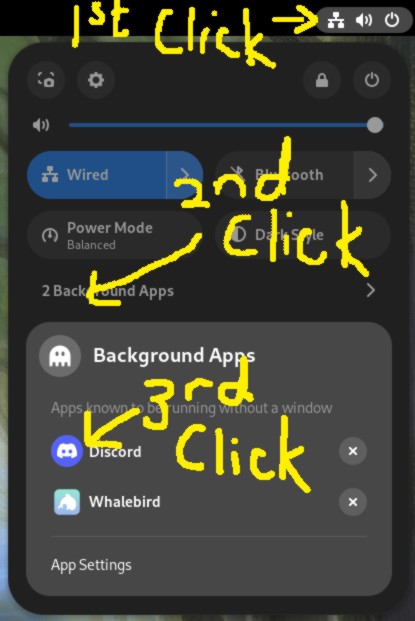
It's 2024, people expect apps to have little icons near the WiFi icon. Why is Gnome throwing out decades of people's training and expectations? Wait, what's that?
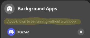
"Apps known to be running without a window". Why is this here, what is going on? Are apps without windows bad? I thought Gnome was supposed to be friendly. Get this jargon out of here! Get that ghost out of here too! Why is a background app a ghost? Why is the text so faint? This is all bad.
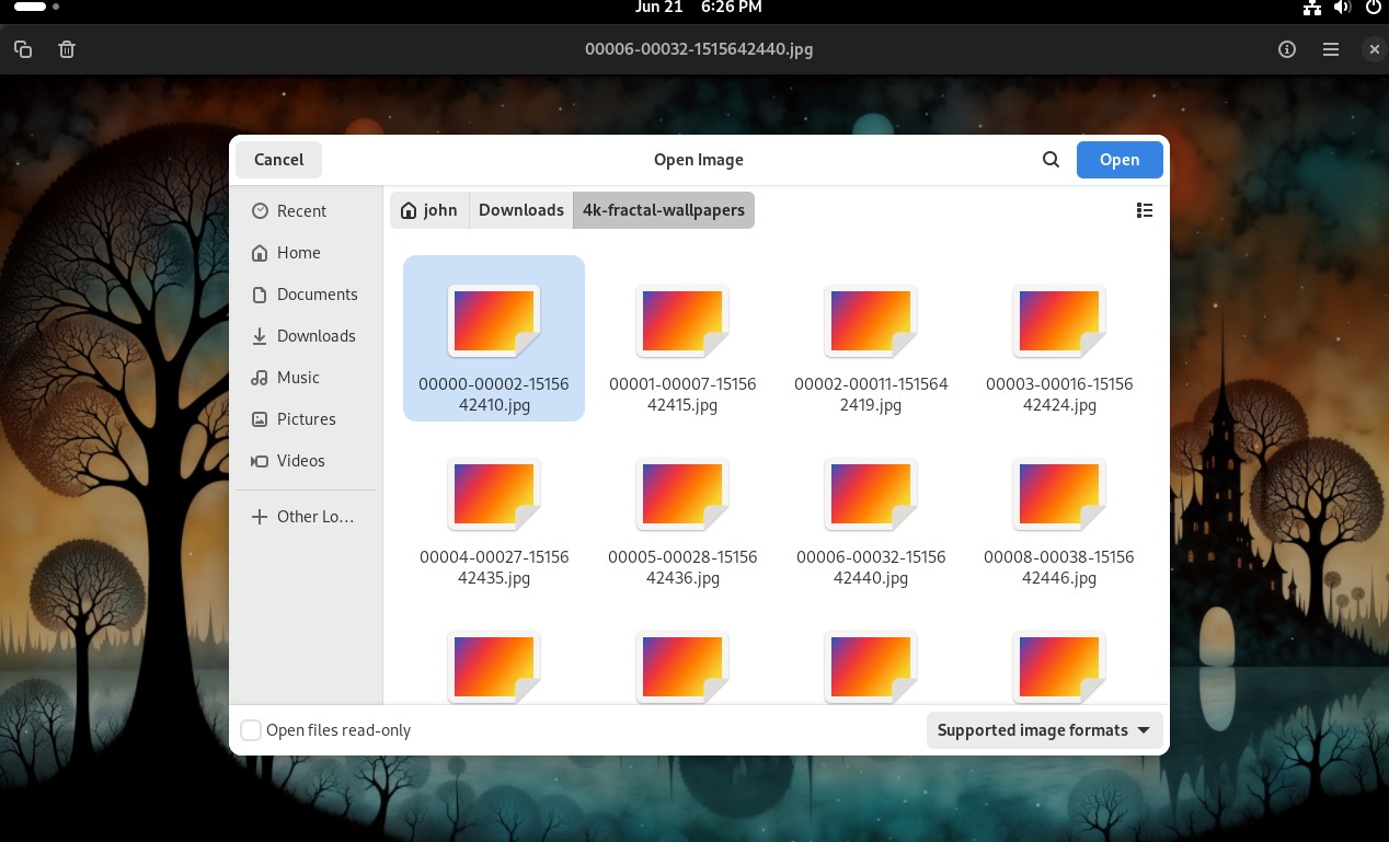
The File Picker is Awful
Breaking News - 8/30/2024: I was informed by a maintainer of the Gnome Calendar app that the file picker will be replaced in the next version of Gnome. However, that doesn't change how all the versions <=46 are bad. Given that the new file picker will still adhere to Gnome's terrible guidelines, I don't know how much improvement there can be.
Gnome's file picker used to suck. It still does, but it used to too. At least remaining bad is a form of consistency, right? Let's see how it compares to KDE.
Plasma: The File Picker That is Good
I could tell right away that I was going to like Plasma's powerful picker.
This picker has:
- Customization: A sidebar that lets you completely rearrange folders (see my "Fave Folder"?). You can also hide the default folders. Handy if you don't ever work with, say, your Videos folder.
- Clear Navigation Controls: A set of back/forward/up for folder navigation.
- 3 View Modes: Three buttons that let you pick three view modes.
- Thumbnail Control: A toggle to turn off thumbnails.
- Sorting Controls
- Zoom Controls: A slider so that even in detail mode you can see thumbnails at the size you want.
- Settings: A setting button that shows a list of available options like "Show hidden files".
- Navigation bar: An obvious text field that you can type or paste paths into.
- File Name Entry Field.
- Filters: so you can show only TXT files, or JPG, whatever.
- Open & Cancel Buttons button located conveniently next to each other.
All of these things lead to excellent discoverability and help get things done quickly. If you want to do uncommon tasks like editing a hidden file, or zoom in on some thumbnails, it's easy to learn how to do it.
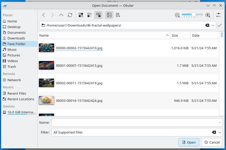
Gnome: The File Picker That Is Real Bad
So here's Gnome's file picker. I want you to take in its sheer elegance, so look at it for a long time. Isn't it beautiful in its simplicity?
My longest list might be for the smallest window! But there's so much wrong:
- Limited Sidebar:
- Your favorite folders are sequestered in a different area and can't be mixed in with the defaults like "Photos" and "Documents". This shows how inflexible Gnome and how uninterested it is in letting people work the way they want. KDE's picker let me put the folder for this review right at the top!
- You cannot hide the default folders.
- More limited folder navigation:
- The folders are listed "breadcrumb" style and you can't click, double-click, or right-click to edit the path. This is unfriendly and confusing, because this is the visible representation of the path and the most obvious place to be able to type in a new path.
- To get to an editable URL bar you have to type a slash, a tilde, or CTRL+L. This is terrible for discovery. How is Grandma, fresh from her Gnome tablet purchase at Radio Shack, supposed to find this?
- Can't just paste a path, and trying to do so results in an "OPERATION NOT SUPPORTED" error. If you're going to hide the URL bar field and require secret keys to show it, at least have the courtesy to allow pasting a path.
- Only two view options: the compact icon view is missing.
- The thumbnail view doesn't have a way to control thumbnail size, making it less useful.
- No visible way to get to settings like "show hidden files". This is bad for clarity and discovery.
- Instead of a sensible options menu, you right click a FILE and are presented with both settings and a whole bunch of disabled items, such as "Visit file". What the heck does that mean, do you mean "go to folder"?
- There is no sorting button, so you can only change sorting options in the detail view. If you want to change the sorting in grid view, you have to go back to the detail view, hit the sorting column, and then switch back to the grid view. Too many mouse clicks for something that should be simple.
- Why is the Cancel button on the far left and the Open button on the far right? It's because Gnome thinks this is an iPhone. But unlike an iPhone, you can enlarge the file picker, which makes the buttons get further and further apart.
- The Gnome file picker's "Recent Files" support sucks. In Plasma you can sort recent items by any of the visible columns (location, type, etc.). In the Gnome picker, clicking on the column names does absolutely nothing. They always stay sorted by "Accessed". This is very limiting and unhelpful.
Being able to sort recent items by, let's say, file type is really handy if you're writing a review and want to quickly find the GIF you made a couple hours ago.
The file picker's limited feature set and unintuitive design exemplify how Gnome has dumbed down its GUI so that no one - not your Grandma, not even The President of Computers - will be happy with it. Would it kill them to add a gear icon so people had somewhere to click to enable things like "show hidden files" instead of clicking blindly? Look at all the room in that title bar! Please do something useful with all the space you're taking up!
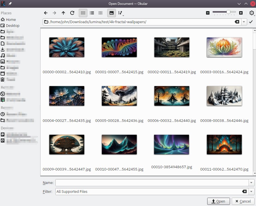
Thumbnails in The File Picker
For 18 years, the Gnome file picker could not show people thumbnails. Now it does, so that should be the end of story, right? WRONG. I'll show you what I mean.
Plasma
Gnome
I did the same thing with Gnome, and here is what I was shown:
In 2024, Gnome doesn't have proper thumbnail support in file dialogs. Apparently this is because the thumbnails are generated by the file manager? And if you don't use the file manager to look at the files first, they don't get thumbnails? This worked in Windows XP in 2001, 23 years ago. I don't think I can stress that enough: Windows XP, which ran on single core computers with 2 or 4GB of RAM, could do this twenty-three years ago. Plasma handles it perfectly - perhaps the KDE team could post their code online somewhere so Gnome can see how it works.
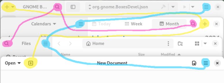
Ready for a Deep Dive?
The next section will showcase a few core Gnome apps, and show how following the Gnome GIR results in bad user interfaces. I'm not singling out these particular apps as particularly bad, because all the Gnome apps exhibit these symptoms in one way or another.
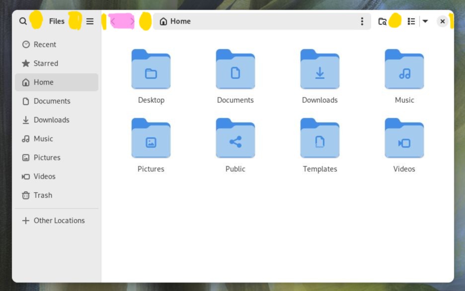
Deep Dive #1: The Files App
Computers have file managers because computers have files and people need to manage them. Maybe someday our children will live in a post-files world, but that is not our reality. Remember some of Gnome's stated goals:
The best apps do one thing and do it well. ... Try to minimize the number of steps required to perform a task.
Gnome
Gnome's file manager, simply called "Files", doesn't do its one thing well. Of course it's hampered by Gnome's generally terrible design language, but we'll go over some specifics here:
- Too many mystery menus
- Terrible context menu
- Lacks features common to other file managers
Too Many Mystery Menus
Let's start at the top, at the title bar. Remember earlier, when I asked which menu contains the most commonly used file operations of cut, copy, and paste?
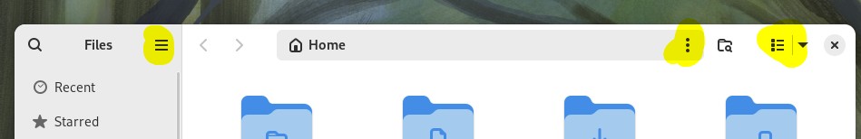
Did you guess "none of them"? Here's what the menus look like:
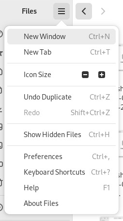
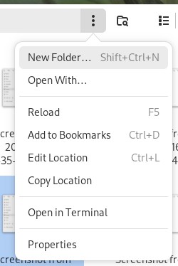
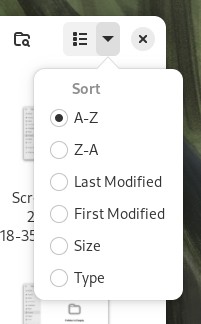
Instead of having menus with clear names like File, View, or Sort, we have the three lines menu, the three dots menu, and the three checkbox (?!) menu. And none of these File Manager menus help us manage files by copying and pasting.

This menu design is pervasive in Gnome apps, to the detriment of both new and experienced people. There is nothing to latch onto here - you just have to memorize what vague icon contains what options.
Terrible Context Menu
Oh right, we still haven't figured out where cut, copy, and paste live. Turns out they're hidden inside the right-click menu. This hurts discoverability, but Gnome wouldn't be content to just make it difficult to find, they also engineered it to be difficult to activate. What do I mean? Here's a screenshot of Plasma's file manager - all the highlighted areas are places you can get to the "Paste" command:
And here are the areas in Gnome:
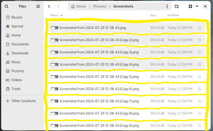
Reasons this is bad:
- It's surprising: How is a user supposed to realize that when they right-click on a file they get one menu, but moving a few pixels down they get a different menu? The difference in click areas is minuscule.
- Tiny click targets: Good luck explaining to Grandma where to click on the tablet you dug out of a dumpster behind the White Castle.
- Tiny touch targets: The menu acts the exact same way on a touchscreen. I hope Grandma is good at precision tap-and-hold!
I'm reminded of someone talking about how tiny click targets are bad:
... we have attempted to ensure that click targets are always easy to target. Teeny tiny click targets pose a challenge in a whole host of situations, from those with poor quality pointing devices, to those who don’t have the same level of motor control as others.
Allan Day, Gnome Dev, about why getting rid of Status Icons is good (spoiler: it wasn't)
Before I show you the right-click menu in Gnome Files, let's look at Plasma file manager's right-click menu:
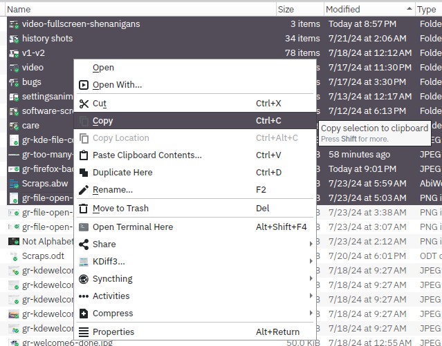
Here are all the correct and good things going on with this menu:
- Menu has things in order of importance.
- Icons to help find things quickly.
- Mnemonics (the underlined letters).
- Tooltip that appears over the highlighted item to explain in more detail what the action does.
- Not shown: All of the common actions are also accessible from the other top-level menus (File, Edit, View, etc.).
KDE shows they understand what a context menu is: it is a subset of actions that exist elsewhere but that may be used frequently depending on context. Now let's go back to that Gnome Files right-click menu, and see where it falls flat on its face:
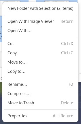
Here's why I don't like this menu:
- Organization: Why is "New Folder with Selection" the top item? Is it more important than opening a file, or cut/copy/paste? What does it do? Does it move, or copy? Is this the most important and most common thing people do with files?
- No icons to help draw your attention.
- No mnemonics to help you quickly choose an option (yes, I held down ALT).
- No tooltips - this would be good to have for the "New folder with selection" option.
- It's gigantic. It's taller than the Plasma menu and provides fewer features. What a waste of space.
A Featureless File Manager
Here are some features that file managers should have because they help people manage files:
- Grouped display: lets people visually group related files together by type, date, etc.
- Preview pane: see a large thumbnail preview of a document.
- Type-ahead find: start typing and jump to a file that matches what you typed.
- Detailed Columns: show columns with useful information such as photo resolution, video duration, etc.
- Sort or filter list of recent files: lets people sort recent files by criteria other than date.
- Filtering: only show files matching a file name you specify.
Plasma supports all these very useful features, and Windows can do 1-5. Even MacOS' Finder can do 1-4. Gnome can't do any of that! It's not surprising, because Gnome excels at being inflexible and limiting.
An Unfair Comparison
This table shows how many lines of code each file manager has, and what percentage of the above features it supports. The data was generated using David A. Wheeler's 'SLOCCount'.
| File Manager | Lines of Code | % of Above Features |
| Dolphin (KDE) | 44,754 | 100% |
| Files (Gnome) | 88,134 | zero. Maybe even negative. |
Is this a fair comparison? No. Do I care? Yeah, obviously. How can you have double the amount of code in a project and yet have so few features? Would it surprise you that once upon a time the Gnome File Manager had more features, like dual panes, an option for a sidebar that shows your whole computer, etc. Maybe it wasn't as elegant, but it could get things done. Did Gnome care if people used dual panes? NOPE.
Alan Cox, of Linux fame, said it well:
If you want to understand the importance of not suddenly changing your users' experience, I would go and take a look at GNOME 3.0. Irrespective of whether it's a good user interface design or not it's a demonstration of why you don't suddenly change everything on people who rely on what you were doing.
- Alan Cox
So why design a file manager that can't do any moderately advanced file management? How could a programmer look at all the other file managers out there and think "yes, the thing I am developing is competitive and people will like it". You can't break people's workflows just to pursue "elegance" - it shows you don't value their time.
Here are some possible reasons to publish such a bad file manager:
- They can't figure out how to make useful features work within their limited design language.
- They never asked anyone what features are helpful for managing files and thought they knew better.
- Failed to look at the state of the art / what other projects were doing.
- They don't have time because they're too busy figuring out how to make the menus worse.
- They think a workflow that they personally do not use or couldn't conceive of has no value.
- They don't want Grandma to have that kind of power.
Call me crazy, but I think the Gnome File Manager might be real bad.
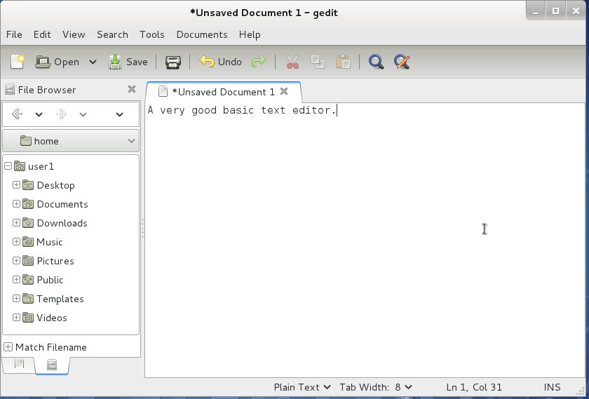
Deep Dive #2: Text Editor
Gnome's version of Windows Notepad can show us two important things. One is that, just like with Files, following the GIR results in less powerful, useful programs, and the second is that Gnome will delete features in order to adhere to the GIR, alienating people who used those features and interactions.
This Mastodon post puts it well:
In an ideal world, software vendors treat their GUI designs like they treat their dev facing APIs: they are implicitly a promise that a particular sequence of keys will do a certain task. that a feature will be found in a specific sub menu. [...] Arbitrary UI revamps are usually not anything that is particularly enriching to the human spirit . I beg you to remember that most people aren’t as desperately obsessed with computers.
History of Gnome's Text Editor
I have gone back in time and installed old versions of Fedora/Gnome to show you that the text editor has shed features over the years.
Here are some historical records of Text Editor:
The version with Fedora 15 has lots of features you'd expect a text editor to have: a friendly toolbar, and menus to give an overview of what's possible. It even had an optional side panel that let you browse files in a folder, handy when you're working on a programming project. There's a plugins menu that lets you add features. It's good! And it stayed good for a while. But then...
Gnome replaced the convenient menus and toolbars with the burger menu. Most of the features are intact, like plugins. The View submenu still lets you pull up a file browser. But we can see the interface starting to fall apart. For example,the weird decision to have the "Open" and "Save" buttons on opposite sides of the window. I guess this was done for ELEGANCE but it just means the interface slows you down. The menus don't list the shortcut keys, making it harder to learn the program. But they weren't finished ruining it...

This is the version shipped with Fedora v37. This version:
- Has no file browser.
- Has no plugin menu, so I assume plugin support is gone.
- Got rid of the Save button, which is arguably just as important as Open. Why would you make your Grandma have to open a menu on her tablet just to save a file!
- Has two mystery meat menus that don't hint at what's inside.
- Is """elegant""".
The Text Editor As It Is Now
I cannot fathom why they removed so many features. But they did, so I'll criticize what they did include. Look at all these screenshots:
Let me try to talk through the pain:
- The Save button is gone - how are you supposed to quickly save files on a tablet?
- The "Go to Line" feature is now only accessible via keyboard shortcut, there is no GUI button or menu option to tell you that it exists other than the "keyboard shortcuts" help screen. What is this, Vim?
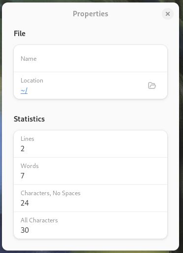
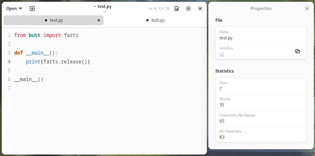
- The properties window is terrible:
- The "Name" and "Location" are already in the title bar.
- The window takes up way, waaay too much space for what are only 4 unique pieces of info.
- It doesn't change based on what tab you have open. If you want to see the properties for another file you have to open the burger menu and choose "Properties" again.
- To cut down on wasted space it should be a status bar line, or a pane docked to one side of the window.
- It's a boring list of text.
- It has an option to draw grid lines behind your text, but it's based on the font size and can't be configured, and the color can't be changed. In particular, it doesn't really help me track whitespace when editing a Python file.
- The burger menu puts the color scheme (default / light / dark) first. Is that really the most important option that people are going to want to change all the time?
- The Zoom controls are just a minus sign, a percentage, and a plus sign. No indicator what the % is a percentage of, and of course this menu doesn't have tooltips so 🤷♂️.
- The "Show Line Numbers" option doesn't just control the line numbers in the left margin, it also enables a tiny Line # / Column # next to the wrench menu.
- If the wrench icon is the "View Options" menu, why aren't the color scheme chooser and zoom controls in there? Somebody didn't think this through.
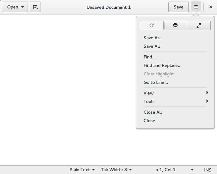
- The search/replace dialog overlaps your text and can't be moved, instead of being an independent window. Why?!
Maybe you wonder: do text editors even need to have features? Yes! I think a text editor is one of the most technical programs that people have on their computer. Even Windows Notepad! Why? Because no "normal" person ever has to edit a text file. If you need a plain text editor, you're already doing something nerdy and technical. The number of people using Text Editor to write apology letters to their grandma for giving them a Gnome tablet is zero. If you're using a text editor, you're editing config files, scripts, or code, so there should be features to support you.
The removal of Text Editor's features is also disappointing because KDE's text editor has had the opposite evolution. It started basic, but is now quite powerful. In addition to all the basics (like an Open AND a Save button), it supports LSP (for integrating with various programming languages), plugins (for extending its abilities), and projects (for working with groups of files). But you don't HAVE to use ANY of that, you can just run it and start typing.
The biggest thing any program can do is not the technical details of the program itself, it's how useful the program is to users. So any time [a program] breaks the user experience, to me, that is the worst failure that a software project can make. [...] No project is more important than the users of the project.
- Linus Torvalds, inventor of the Linux
There was no good reason to castrate Gnome's text editor, especially given that it's a Linux text editor. It is a victim of Gnome's disregard for the past, and a disregard for people. Changes like this show that Gnome cares more about adhering to their design "philosophy" than it does about providing people with a useful, stable working environment. It feels like they don't even want to maintain a text editor. Maybe they shouldn't, and could instead ship someone else's. There are plenty already out there that do a much better job.
Two Special Mentions
Before I wrap up the usability section, I want to quickly (hah!) highlight two more Gnome things: the App Store, and the Add User control panel. I think you'll agree that they really are something.
Special Mention #1: Gnome App Store
Gnome tries hard to copy the MacOS feeling with the screen-spanning black bar and the Mission Control knock-off. The Gnome App Store is another one of these. It's a basic app, but I noticed a few things:
- Too much whitespace. Maybe the most whitespace of any Gnome app.
- Conflicting and unclear information about how much disk space an app is going to use. "Download Size" usually means the size of the file you download, not how much space it uses when it's installed. For an example of a good interface, Steam simply lists this as "Space Required" so there's no question.
- Can't enlarge the screenshots. Why? Even my iPhone can enlarge screenshots, and they're already almost as big as the screen.
- Bad information, like licensing, for some apps. Whoever is maintaining the App Store database needs to step it up.
- Too many warning labels. How is someone supposed to know the difference between all these notices and the security implications?
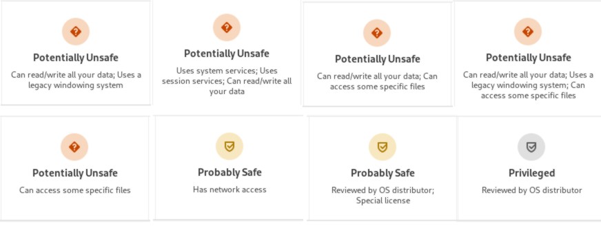
Which one is worse? Calling out apps for being potentially unsafe, or telling someone "eh, it's probably safe"? The App Store is a mess of half-baked ideas and bad design.
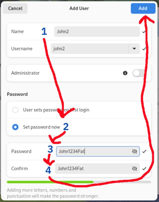
Special Mention #2: Add User Control Panel
I wanted to add users to my Fedora install so I could get some screenshots of apps in their default state, but I found a fresh source of misery. Here's the add user screen.
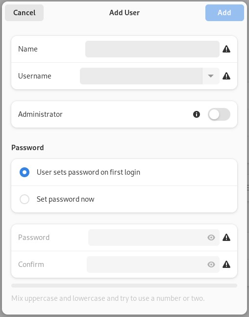
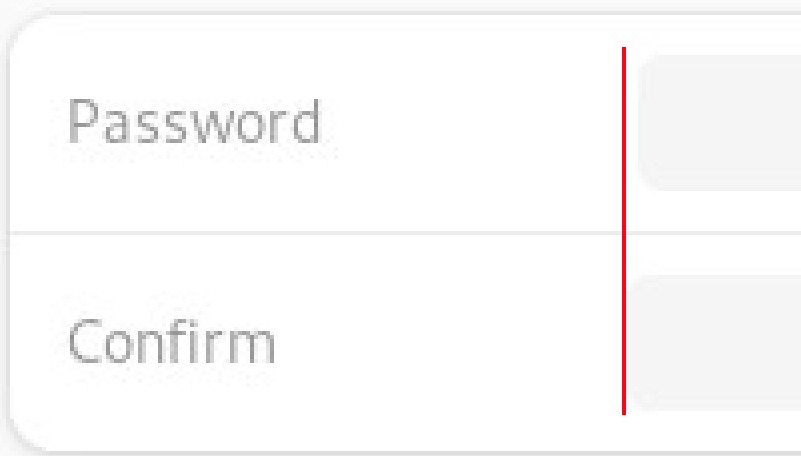
And while I'm here: the name and the username fields aren't the same size, and neither are the two password fields - so much for elegance.
After I entered a Name, it populated the Username as well. I was curious about the dropdown, what's in there? This:
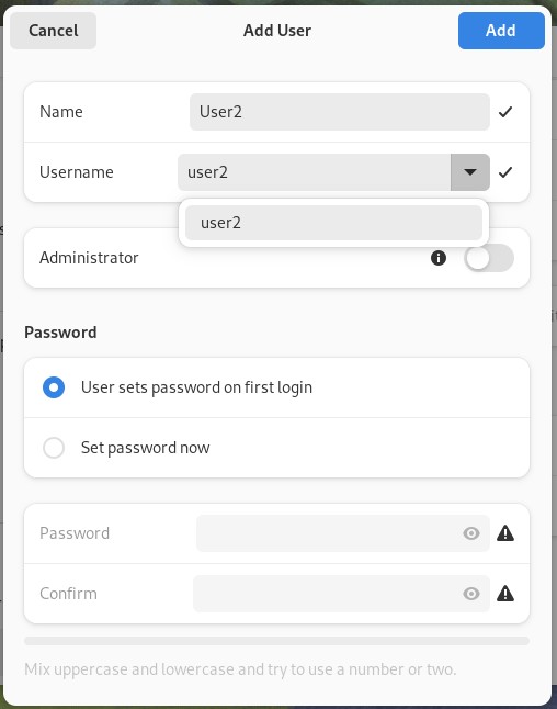
Why is it a dropdown with one name? I guess it's for handling user name collisions. It would be nice to be able to see the list of existing users that's behind this window, but you can't, because this Add User window won't let you drag it away.
But now it's time to set the password. I'm going to use the same one I used for the account I set up when the Fedora install was finished, "John". It's nice that there's no restrictions. Oh, wait. I almost didn't see this because of the incredibly faint text:
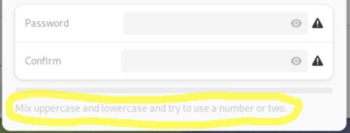
This sure is something. TRY to use a number or two? Well first I'm going to TRY my preferred password:
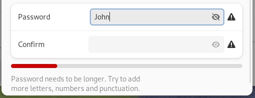
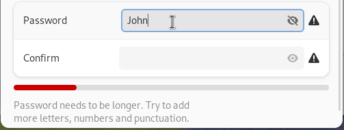
Again with the try. How about you tell me how much longer the password needs to be? Or maybe we can keep guessing:
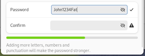
So, again, instead of telling us how long it has to be, we keep typing until we hit the next roadblock. And again with the "try" language. There isn't any trying here, Gnome should be explicit in what it's looking for. If I add another word, suddenly I clear the "Try to avoid common words" error:
But "John" and "Fat" are common words, so I don't know why it lets me use this password. Now that we've filled out this form from TOP to BOTTOM, let's hit the Add button. Which is all the way back at the top. Can't there be any good design in this system?
Gnome's Usability: It Bad
So what do you get when you make a "unique" interface, an interface that requires users to waste time learning less efficient, multi-step ways to do things, an interface that doesn't work well with a mouse, keyboard, or touchscreen? You get Gnome. It's uniquely unfriendly to both computer and phone users. You get UI changes that remove features, for no actually good, user-facing reason. No one cares if your notepad app is elegant, they just want to be able to keep using it like they always did.
And speaking of using a computer like they always did, it's time for the final topic.
CHAPTER 4: CUSTOMIZATION
When we began this journey, I said I used Linux because I:
- Preferred open source software.
- Didn't like Windows.
- Don't want Apple hardware.
- Wanted to tinker.
- Wanted control of my computer.
The list's common thread is preferences. I want to have an active choice in how I use a computer. Linux is perfect for this, it's full of choices: distros, desktop environments, text editors, web servers, programming languages - just about every part can be exchanged for another.
So imagine my surprise when I found out that Gnome is less customizable than Windows, even less customizable than MacOS.
Gnome: My Way or the Highway
... [Gnome's] general configurability of the desktop has been broadly crippled.
- Ryan Paul, Ars Technica Review
Gnome has almost no support for customization, which is frustrating. Customization can give people a better experience, or help them settle in by tweaking things just the way they like them. Customizations can help people come up with novel ways of using their computers that the designers didn't originally think of.
Gnome doesn't care about that. The project cares more about making your computer into an iPhone, cares more about elegance. Here's a whole bunch of stuff that Gnome is rigid about:
- Dock
- Interface style
- Backgrounds
- Toolbars
- Keyboard shortcuts
- Folder paths
- Favorite Folders
Let's go through each one and see how it negatively affects the computer experience.
Customization Fail: Dock
As I said earlier, I use a 21:9 wide screen monitor. My Windows 10 taskbar is docked vertically on the left. One of Microsoft's bigs missteps with Windows 11 was taking that feature away, and is part of why I ditched Windows at home. On a wide screen there's a lot more horizontal room than vertical, so it makes sense to dock the taskbar to the left or right side in order to save vertical space.
I'm also gonna bring up my handicap at this point, which I don't think I've ever done online before. I'm blind in my right eye, which is why I don't use dual screens or screens bigger than about 34 inches. I don't want to turn my head all the time, and prefer to keep the taskbar where I can always see it (the left).
Plasma & Cinnamon
Plasma and Cinnamon both start out with the taskbar docked to the bottom of the screen. To move the dock to the left in Plasma takes 5 clicks (I counted). In Cinnamon it takes less than 10 (I didn't count). The clocks need to be bigger but I can fix that by making it wider like the Windows 7/10 taskbar.
Gnome
There's no screenshot of a side bar because Gnome doesn't let you move the dock or the black bar. This is unfortunate, especially considering that previous versions of Gnome defaulted to the left side of the screen.
Customization Fail: Theme Options
I have used Linux for over 24 years. Even back in the early 2000's it was cool to see all the different themes you could have. You could tailor it to suit your tastes, it was awesome. Most Linux systems still have that. Let's look at what Plasma and Cinnamon offer.
Cinnamon
Mint's Cinnamon does a really great job. You can change colors AND how the buttons and windows look. If you prefer larger buttons, they've got you! If you prefer to save screen space with compact buttons, you can do that too! The only thing that does customization better than Mint is KDE.
KDE Plasma
Look at all the possibilities! You can make your computer look however you want, really put the personal into personal computer.
And if that's not enough, Plasma makes it easy to download more themes, widget styles, and cursors, all from within the control panel. Here's a link to a beautiful Irixium theme if you want your computer to look like old SGI's take on UNIX (I'm not being ironic, that style is cool).
Gnome
Let's see what options we get.
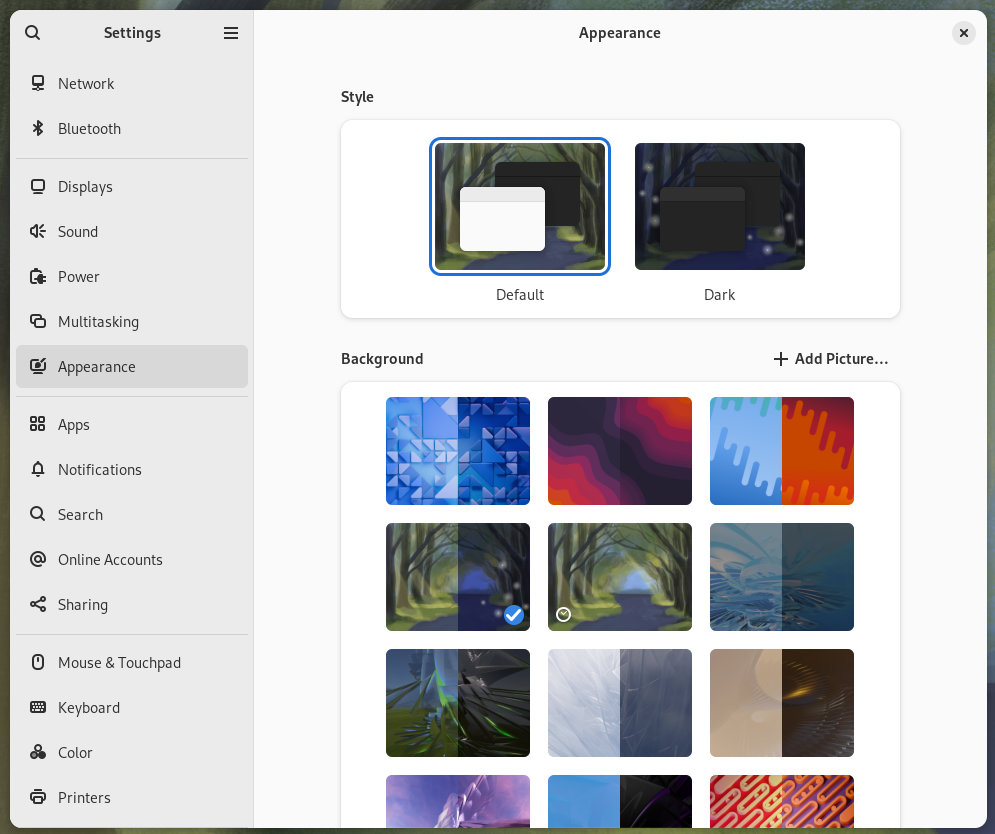
An option called "default" where things are light or dark depending on ???, and an option called "dark" where things are dark. No way to change anything else. Even the background options are insufficient:
- No way to choose how/if the wallpapers are resized.
- No way to set a tiling background.
- If you believe people run Gnome on phones, then why doesn't this work like an iPhone's wallpaper picker and let you zoom and crop the wallpaper to fit exactly how you like it?
And that's it. That's all you can change. You can't change fonts, icons, title bar colors. Hey, wait, it feels like there's something else missing from this screen...
Customization Fail: No Solid Color Backgrounds
I was already concerned about Gnome lacking any meaningful customization, but it was even worse than I imagined. You cannot choose background colors. This is the second thing that made me want to write this article.
Ever since Windows 3.1 I have been able to set my desktop background to a solid color.
Why would I want to do that? My reasons:
- When using my computer remotely, solid colors improve performance because they compress well.
- I don't like being distracted by a busy background.
- I'm used to it.
This isn't an option in Gnome. Here's a discussion where developers talk about wallpaper related things: https://gitlab.gnome.org/GNOME/gnome-shell/-/issues/4936. In that discussion there are Gnome users who give even more reasons for supporting solid colors:
- Visually distinguishing VMs.
- Chroma key (green screen) effects on the screen.
Here's a table listing the desktop environments I've used over the years and their support for solid background colors:
| Environment | Supports drawing a colored rectangle on the screen |
| Cinnamon | ✅ |
| Plasma | ✅ |
| LXQt | ✅ |
| MacOS | ✅ |
| iOS | ✅ |
| iPadOS | ✅ |
| Windows 3.1 | ✅ |
| Windows 11 | ✅ |
| Xfce | ✅ |
| Gnome 1 | ✅ |
| Gnome 2 | ✅ |
| Gnome 3 | ✅ |
| Gnome 46 | ⛔ |
As you can see, even Gnome 1-3 supported the feature, so why was it removed? How does removing solid colors benefit the user? It doesn't. There's only downsides (hey, I just came up with Gnome's new motto).
Customization Fail: Toolbars
To provide maximum flexibility for users and their tasks, design your toolbars and status bars to be user configurable.
Well said, Microsoft. Customizable toolbars are common across desktop GUIs because they help people take shortcuts, which help speed up tasks. Here's how Plasma's file manager does it:
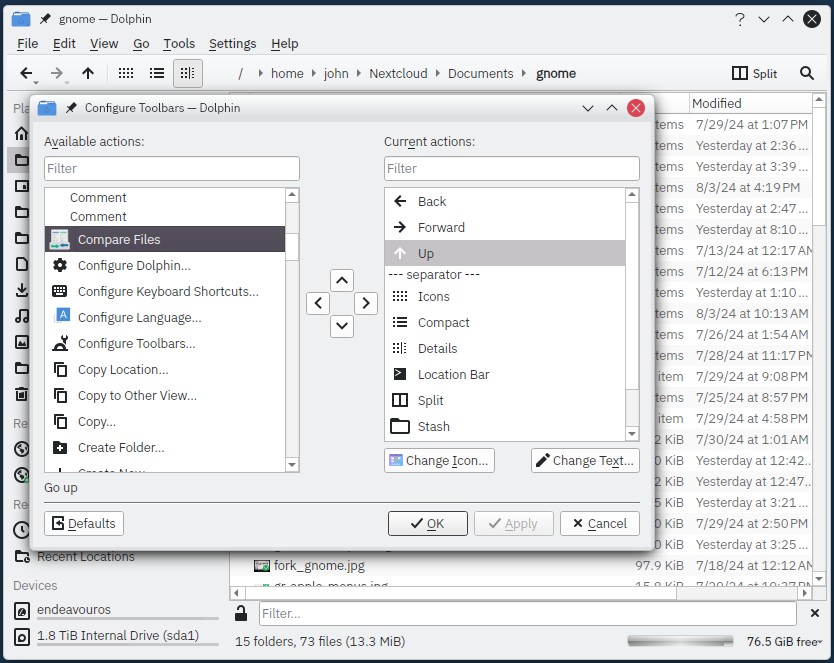
Let's look at Gnome Text Editor again, this time maximized on a 1280x800 screen.
Why don't Gnome apps have customizable toolbars? They can be so useful! Toolbars help users set things up for their own particular workflows. In Text Editor's case, I would add a "Save" button to the title bar so that I can use the advanced workflow of "saving my file in one click".
Gnome is vaguely aware of the usefulness of this type of customization because they let you drag app icons around on the app launcher. Reorganizing the app screen helps you put the apps you care about in positions you prefer. Toolbars are the same thing, just on an app level; they let you reorganize a program's commands in positions you prefer. Why doesn't Gnome support this basic functionality?
And you know what's nice about customizing toolbars? It's optional! No one has to customize a toolbar or ever look at the customize toolbar screen if they don't want to. Systems like Plasma pick sensible defaults, then allow people to change it to suit their needs. Gnome assumes they know best and does not provide any way to change the software to better suit you.
Customization Fail: Keyboard Shortcuts
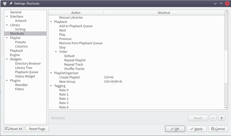
Almost all the Plasma "core" apps support custom keyboard shortcuts. Even a tiny app like the Wallet Manager supports it. I think the underlying frameworks that Plasma uses must make it easy to support such customization, which is a good thing. Even non-KDE apps like the up-and-coming music player Fooyin have custom keyboard settings, and that's just a one person project.
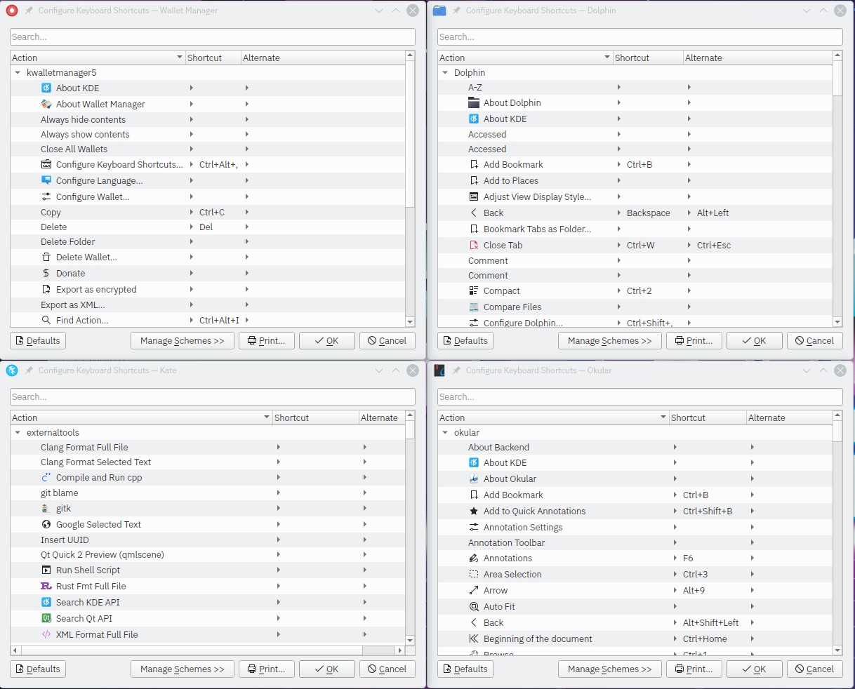
Gnome apps, at least the ones in Gnome "core", don't support changing keyboard shortcuts. I assume this is because the Gnome frameworks don't provide a convenient way to provide such a basic feature. The only shortcuts Gnome supports changing is system-wide stuff like workspace management. But back in Files app land, if you want to assign a shortcut to "New folder with selection", too bad, you can't.
Skimping on keyboard shortcuts has the same problem that non-customizable toolbars have: they assume that the developers made all the correct decisions and that all people everywhere will want to use their computers how the developers decided.
Customization Fail: Folder Paths
I keep my downloads on a different physical SSD from my main drive. The downloads are on a SATA SSD, my main drive is NVME. I want to set my Downloads folder to point to, let's say, /mnt/sata/Downloads.
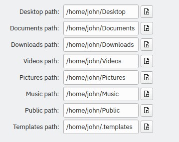
In Windows this is easily accomplished by right-clicking the Downloads folder in the file explorer and changing the path property. In KDE, this is easily accomplished by right-clicking the Downloads folder in the file manager and changing the path property. You can also change it in the Settings app:
In Gnome, there's no way to do this with either File Manager's preferences or through the Settings app. You have to use a command line tool called xdg-user-dirs-update to set custom folders. This is not user friendly. Windows got this correct back in 2001: If you didn't like where "My Documents" were stored, just right-click and change it. Gnome offers no discoverability for this feature. I had to Google how to do it because the Settings app doesn't let you change it.
Customization Fail: Favorite Folders
I touched on this before, but you cannot reorder the sidebar in the file manager or the file picker dialogs. All of YOUR favorite folders MUST stay below the Gnome team's favorites. Plasma doesn't care and lets me do whatever I want. I needed to get to my "gnome" folder constantly when writing this post, so here's what my Plasma sidebar looks like:
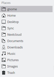
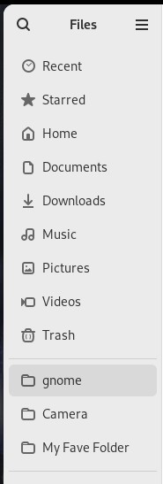
It doesn't let me remove the Videos shortcut, and I can't move my "gnome" folder to the top of the list. This inflexibility benefits no one, it only makes the system rigid and unhelpful. It ignores the fact that the computer is YOUR tool, a tool that can change its shape to fit how you want it to work. What Gnome did here isn't elegance, it's garbage.
Gnome's Rigidity
Gnome's lack of meaningful customization severely limits its ability to empower people. If a person cannot customize something and make it their own, they're going to feel constrained. Gnome can't even support the simple use case of "I want a solid color background for minimal distraction". How can it be taken seriously?
CHAPTER 5: Fixing Gnome
If you're used to Gnome, this might be the part that you expect I'll be mentioning Gnome Tweaks and Gnome Extensions. Well, you're wrong, because those things can't fix Gnome, but I'll talk about them for completeness.
Gnome Tweaks: The Other Half of the Settings App
Doctor's warning: While GNOME TWEAKS™ can help alleviate the symptoms of living with Gnome, GNOME TWEAKS™ is a treatment, not a cure.
What is Gnome Tweaks? Here's what the Gnome project says it is:
Gnome Tweaks allows adjusting advanced Gnome options.
Here's what it actually is:
Gnome Tweaks is an admission that the Gnome project picked bad defaults.
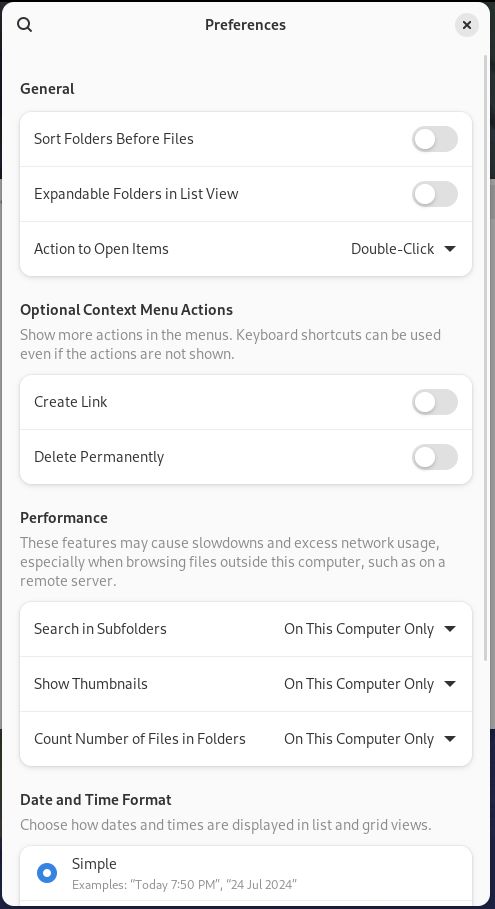
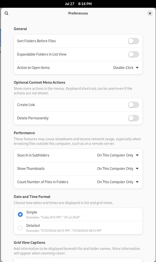
Tweaks is basically another Settings app. It allows you to change """""advanced""""" options such as:
- Changing how wallpaper is stretched or scaled on the screen.
- Changing fonts.
- Changing icons.
- Enabling minimize/maximize buttons.
- Disables the "sticky" child window feature.
- Enables window resizing with right-click instead of middle-click.
So why isn't any of this part of the regular control panel? Tweaks isn't written by some hardcore customization enthusiast, it's provided by the Gnome team. All of its features should be included in the Settings app.
And how did they decide what should be in Tweaks? "Color Calibration" doesn't count as advanced so it's in Settings, but stretching wallpaper is advanced so it's in Tweaks?
If you buy into the the long pronouncements and blog posts about why removing the minimize/maximize buttons is good, it's funny that the Gnome team provides their own app for turning them back on. Is it be because 98% of computer users are used to that particular workflow? If I browse the Gnome subreddit, I see these heavily customized Gnome desktops that change the defaults (most of which change the min/max/close buttons in the titlebar). None of this can be done in Gnome unless you use Tweaks and other 3rd party tools.
To drive home that Gnome's defaults are bad, I'd like to throw out some numbers (of perhaps dubious quality, but they're what I've got):
On Arch Linux, gnome-shell is installed on 21.4% of all Arch installs and Tweaks is installed on 17.4%. If you assume that gnome-shell == Gnome users, then 81.3% of Arch Gnome users have Tweaks.
In the current stable version of Debian (12), if you install Gnome during the initial graphical setup, Debian defaults to also installing Tweaks.
On the Red Hat site Opensource.com, a poll shows that 86% of Gnome users use Tweaks.
Seems like Gnome users prefer to have more options than what Gnome provides, and/or Gnome has bad defaults that annoy people. It's probably both! But Tweaks can't fix stuff like how bad the Great Black Bar is, which brings us to Gnome Extensions
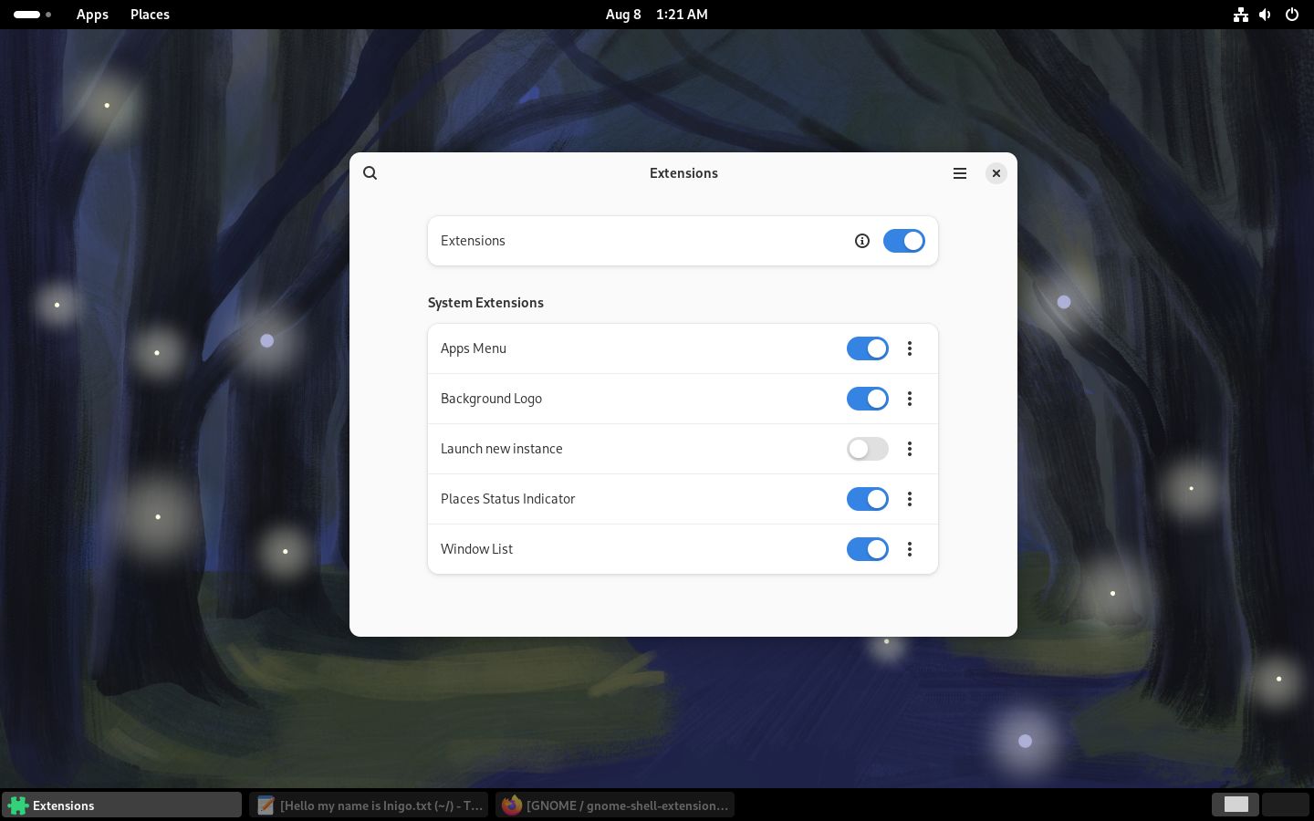
Gnome Extensions: Still Not Good Enough
Gnome Extensions are a way to extend Gnome. They can do things like give you a real system tray and fix some other bad decisions that Gnome made. But there are a few problems with Gnome Extensions:
- They are not mentioned ANYWHERE on the Gnome desktop, so I'm not sure how you're supposed to know they exist other than searching the web for "add system tray to Gnome". Searching the Gnome Help app for "extensions" doesn't return anything relevant. Why aren't they discoverable? There is a set of extensions by the Gnome team, don't they want people to know they exist?
- Per the Gnome developer docs, there is no guarantee that extensions will continue to work in each subsequent version of Gnome.
To install them you have to install the Extensions app, which isn't included by default in Fedora. If you install it, you can make your Gnome look like a somewhat more reasonable desktop:
But there's more advanced stuff. You have to extend Gnome even further with a third party app called "Extension Manager". This app lets you install more extensions that enable more customization. We get closer to a usable desktop with it:
But, just like the Gnome docs promised, extensions can break with each new release. And they do break, consistently. Here are links to posts about extensions breaking in Gnome 46, 45, 44, 43, 42, 41, 40, 3.38, 3.34, 3.32, and 3.30. I'll stop there because that covers from 2018 to 2024. Gnome breaks extensions every single release, so I don't see them as viable. If Gnome wanted people to use extensions, they would provide a stable way to do so.
Gnome Extensions are essentially the same thing as Minecraft mods: they're brittle, they have to be updated constantly, and they're required to make the base product not suck. Can you imagine if the workflow you relied on every day was dependent on the whims of an Internet rando who might get bored of maintaining your favorite extension after they graduate high school?
Tweaks & Extensions Don't Cut It
So Tweaks can help alleviate the pain caused by bad defaults, and Extensions can make the Great Black Bar more useful. But these are not fixes. The fundamental design flaws can't be fixed by Tweaks or Extensions, because they can't fix the fact that Gnome threw all the standard conventions away and ignored the past. A couple extra settings can't undo Gnome's choice to remove all the good features of a desktop GUI and mash the remains into a tablet-shaped disaster. Extensions can't fix the terrible menu designs, or provide you with customizable toolbars. But all is not lost!
The Fix
I could tell you that if Gnome started adhering to guidelines written by wiser people, then Gnome would be fixed. But I'm actually going to tell you it was already fixed 12 years ago! It's true! As soon as Gnome 3.0 was released, the Linux Mint team recognized what a steaming pile it was and started working on Cinnamon as an alternative. The Mint team's Cinnamon desktop is the fixed version of Gnome. It uses mostly the same underlying libraries (GTK), but has retained the features and power that people expect from a desktop computer. They've done a great job over the past 12 years to make Cinnamon a solid product, one that works like you expect and doesn't surprise you.
My own personal fix is to use KDE. Even back in 1999 KDE had the features I cared about, and it has really matured with the latest version of Plasma. It is still an incredibly flexible, customizable system. I can make it work how I want to work, and I do. I put my taskbar on the left, which helps my muscle memory when switching from Windows at work to Linux at home. I've chosen window themes, fonts, and button sizes that give me more room on the screen for the stuff I actually care about.
And I can set my background to a solid color, just like I could in Windows 3.1.
Ignoring bad ideas doesn’t make them go away, they will still eat up funding. [...] Killing ideas is a necessary part of science. Think of it as community service.
- Sabine Hossenfelder, from Lost in Math
I think Hossenfelder's sentiment applies just as much to software development as it does to science. The Gnome project is built from the ground-up on bad ideas:
- People's experience should be chucked in the trash can for the sake of some ill-conceived notion of elegance.
- Computers should be limited to the power and flexibility of an iPhone.
I am 100% serious when I say there's no need to fix Gnome. If Gnome addressed all these issues tomorrow then Gnome would be even more pointless than it already is: it wouldn't be any different from Plasma or Cinnamon. There is no reason to continue the Gnome project when the KDE and Mint people are actually making useful, people-friendly systems.
Here is a quote from Gnome dev Toby B's blog:
The “traditional desktop” is dead, and it’s not coming back. [...] Instead of trying to bring back old concepts like menu bars or status icons, invent something better from first principles.
If that quote doesn't show that Gnome is unfixable, I don't know what will:
- Grand pronouncement with nothing to back it up. Gnome is a fraction of a fraction of desktop use, the rest are "traditional desktops".
- Unwillingness to acknowledge that the far more popular MacOS has menus baked in and seems to be doing fine.
- Assuming that "old concept" is the same as a "bad concept".
- Gnome is going to provide an official extension for status icons, so I guess Toby was wrong about bringing back old concepts.
- In my personal experience, most people advocating doing things "from first principles" are either arrogant ("it can't be that hard to do from scratch") or stupid ("I refuse to learn why things are done this way").
If that's the Gnome attitude, then Gnome's only value is as a dead project with a hundred foot high monument that other developers can visit and say "there but for the grace of God go I".
Final Thoughts
Here's an evergreen quote from 2005 about the whole Gnome situation:
I don't use Gnome, because in striving to be simple, it has long since reached the point where it simply doesn't do what I need it to do.

Please, just tell people to use KDE.

               Linus
If you throw away all the years of people's experience in a failed search for simplicity, you aren't helping anyone. If you get rid of customization because you want to make yet another iPhone clone, then you don't understand what computers are for. If you strip away features you hurt the power users that know what they want. And you hurt the new users because you've limited your interface and customization so much that they can never become power users, because there is no power to use.
Maybe that's what Gnome wants. Maybe it wants to be the Fisher-Price of desktops. I wish them the best of luck. And I hope the people using Gnome will, like a toddler, grow out of baby's first desktop.
PS: please donate to archive.org, which was indispensable while writing this.
Special Thanks
My sincerest thanks go out to longtime friend and fellow computer complainer Tyler Bletsch. His in-depth reviews of my terrible first draft and subsequent slightly less terrible 15th draft was a great boon. This article has a much more cohesive narrative thanks to him.
I would also like to thank the KDE team, because they have basically produced, for free, a better GUI than Microsoft. I don't think I could have switched to Linux 100% if not for the powerful, customizable KDE Plasma desktop. They could always use a donation too!
Further Reading
- A post rebutting all the stuff I said using the classic Twisp and Catsby defence. (alternate archive.org link)
- Interesting article from OMG Ubuntu about stuff removed from the file manager.
- Felipe C.'s One Decade Later, Gnome Still Sucks article. This is where I found the Linus Torvalds & Alan Cox video.
- An archived copy of the GEdit (gnome text editor) developer's thoughts on Gnome Development.
- A comedy website where a bunch of GTK app developers who give away free software complain about users hurting their "brand" when they change the icons.
- A Fedora discussion about how they wisely didn't want to default to the new Gnome terminal because it removed too many features.
- Forum post by a Factorio dev about Gnome window decorations.
Changelog
- Update 8/31/2024: Updated file picker section based on feedback from an unbiased source.
- Update 9/2/2024: A person on Mastodon linked me to this excellent article further explaining why the Files app is hot garbage.
- Update 9/5/2024: Clarified why Gnome + Firefox = 😕
- Update 7/21/2025: Added table of contents per a request from a reader that I didn't notice for a year.
- Update 12/18/2025: Fixed link (thanks, WinnerWind for the head's up!) to FizzyIzzy05's rebuttal.
Comments