The Saddest Gnome Bug
While doing some research, I had to read a bunch of bug reports, mostly related to my article about how Gnome isn't a good interface. Here is the best one by far (and no, it's not about thumbnails).
Gnome Needs a "Light" Theme

- Person makes some really nice mockups of what a "global" light theme could look like, because Gnome doesn't have a pure-light theme.
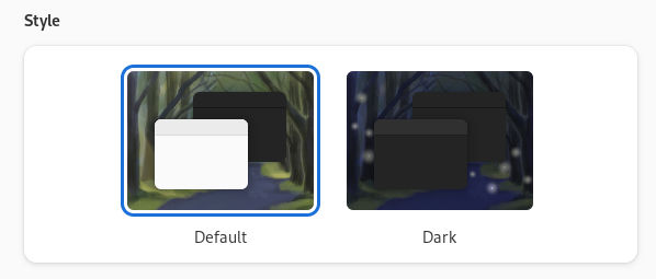
- A reminder that this is what the theme chooser looks like:

There is a Default - a blend of light and dark, and Dark, which turns everything dark. There is no Light. - The best response in the world:
- FWIW this already exists, the prefer-light color scheme just isn’t exposed in Settings at the moment.
- I love this bug! It has everything:
- Person sees a need, and wants to help out, and spends time making over a dozen mockups.
- Gnome already supports this, but since it isn't visible ANYWHERE in the theme settings, no one knows it exists.
- The people who made the actual included light theme must feel great about their work not being visible.
- An existing two year old bug that asks for the light theme to be a choice and then derails about worrying about how showing three options will look on phones.
- But hey! If you want light mode today just go to your Gnome phone, open Terminal.app and type
gsettings set org.gnome.desktop.interface color-scheme prefer-light. Easy!
- Status: Unresolved and very unfortunate. I feel bad for the person who did the mockups.
- Link to bug report.