Morning in Spring: AI Inspiration & Workflow
I've been having a blast using my computer to randomly generate images. A new use I've found for "AI art" is as a source of inspiration. About a week ago I went down a rabbit hole that ended up with me learning a bunch of other tools so that I could execute an idea that I wouldn't have had otherwise.
Original Plan
I recently found out my TV can show my pictures as a screensaver, so I wanted to make some desktop-wallpaper-style images for it. Image generators like Stable Diffusion are great at making abstract backgrounds, probably because an abstract piece doesn't need to be coherent like a portrait or landscape. You don't have to worry about having 13 fingers if there's no people in your picture, and you won't see a pine tree growing out the top of an oak.
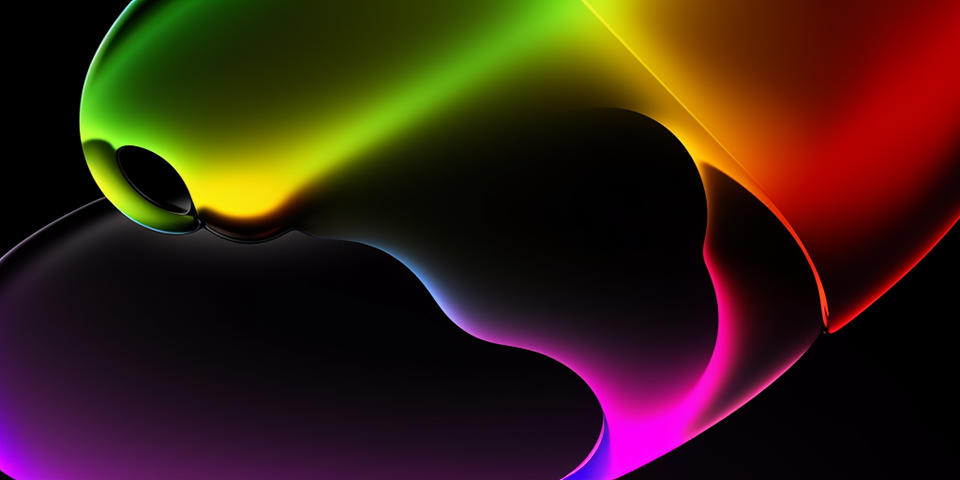
One of my inspirations for the backgrounds was Rodtronics - I've enjoyed his 3D art and use of gradients for years. I came up with an initial prompt: refracted gradient, smooth, rainbow palette, digital render, black background to get the same sort of style. I generated lots of variants of this prompt, mostly switching out color palettes (rainbow, "iron" infrared, etc.) and replacing "digital render" with styles like "brutalist art" or "art by whoever". Some of the results:
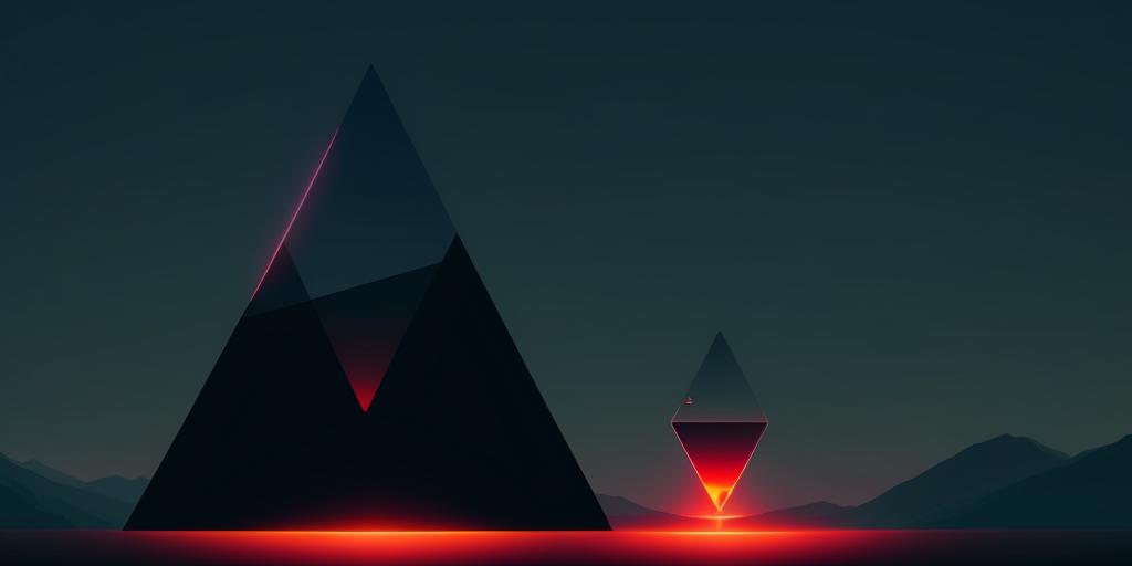
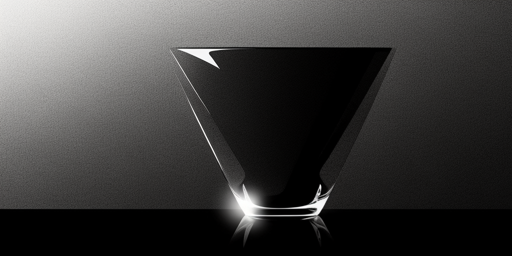
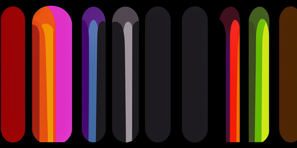
As I tried variations, I started building up a "randomized" prompt using the Dynamic Prompt extension. Instead of just specifying a style, I could make a list of styles, and each time I generated a new image it would select a random style. In particular, I decided to aim for stuff with blues and grays, and ended up with:
outdoor scene, {overcast sky|clear sky}, {cityscape|garden|rural village|cyberpunk garden|forest|meadow|tulip field}, refracted gradient, smooth, {blue and cyan|blue and purple|stormy|stormy blue|blue} palette , lora:epiNoiseoffset_v2:0.8, muted {teal gray|prussian blue|pigeon blue|teal|blue-gray|dark blue-gray|light blue-gray|gray|storm-colored} background, {style of 1940s movie poster|style of brutalist illustration|art by stalenhag|art by beksinski|art by andy kehoe|style of 1980s movie poster|paint splash art style|art deco style|style of stalenhag AND art deco}, blues
If you read through some of the styles above, you'll see I ask it for some generic styles, but also a few by particular artists:
- Simon Stalenhag - he's made some really beautiful sci-fi art books that I own.
- Andy Kehoe - I enjoy his paintings of magical forest creatures. I'd love to own a few prints.
- Zdzisław Beksiński - a Polish painter known for his surreal, nightmarish work.
Inspirations
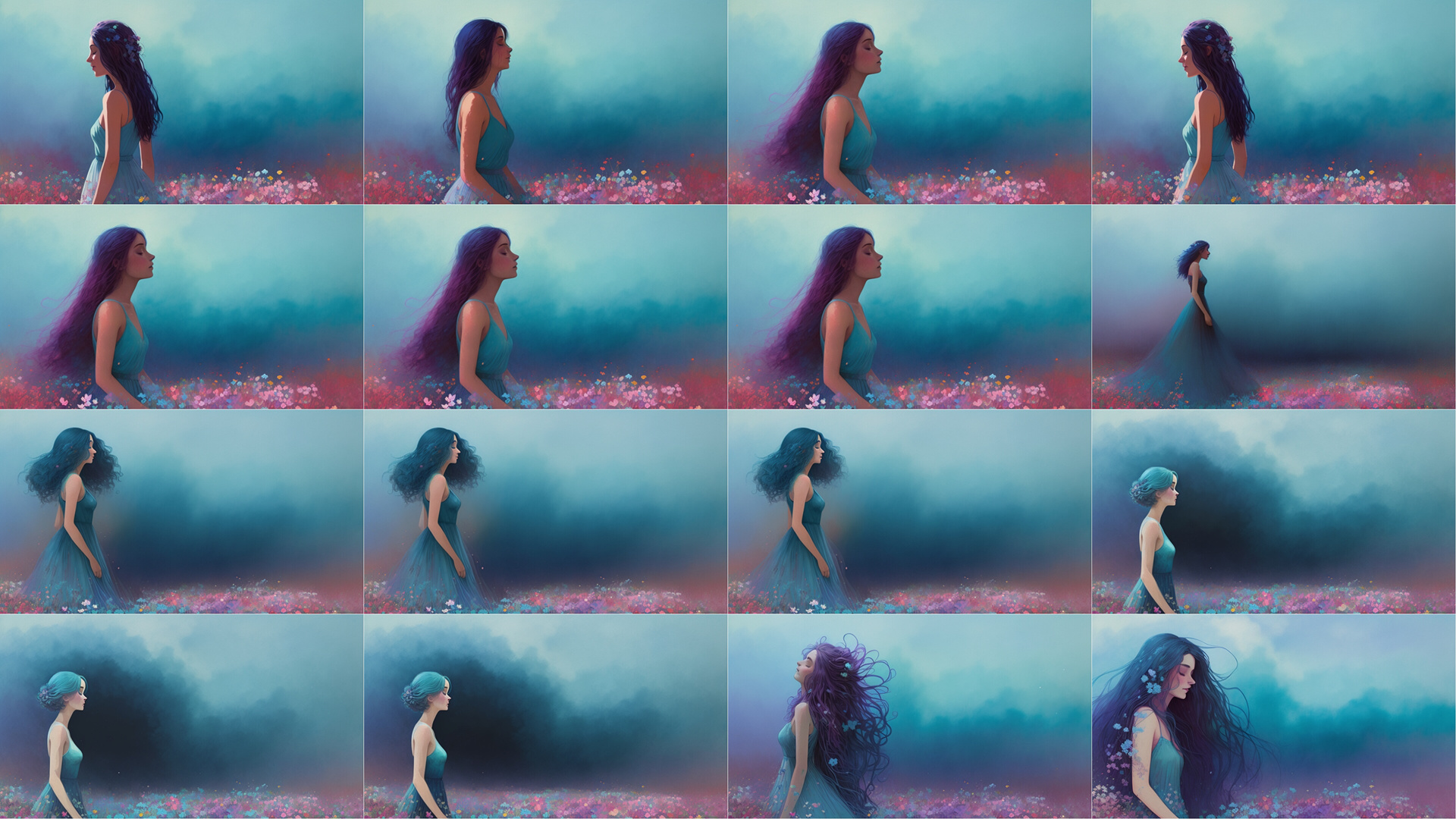
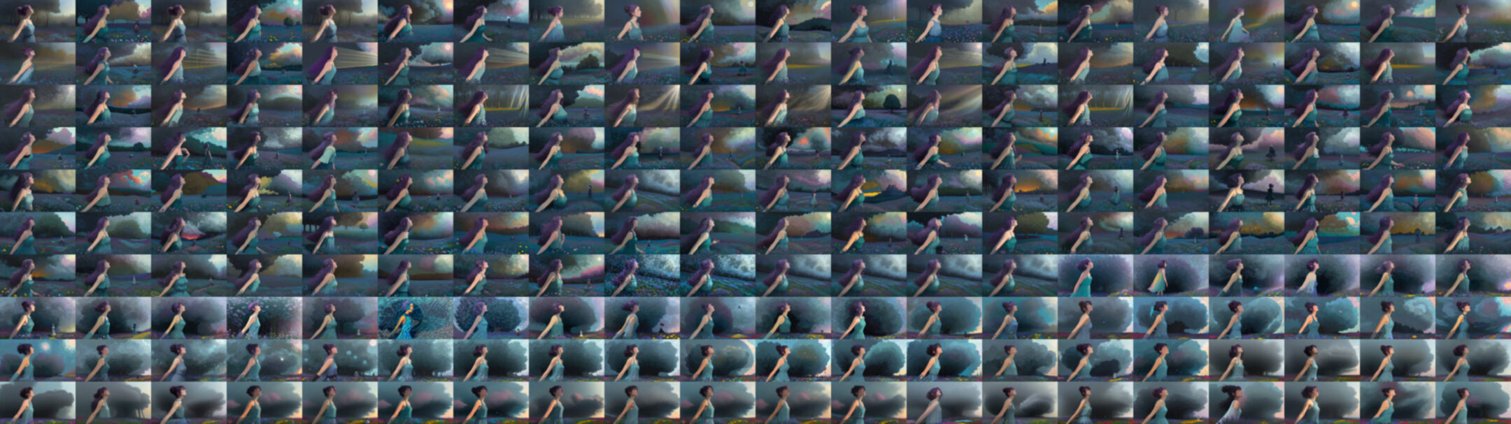
After letting Stable Diffusion run for awhile I had dozens of images to sift through, and I did get some I liked.
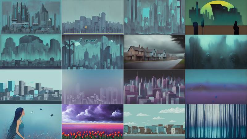
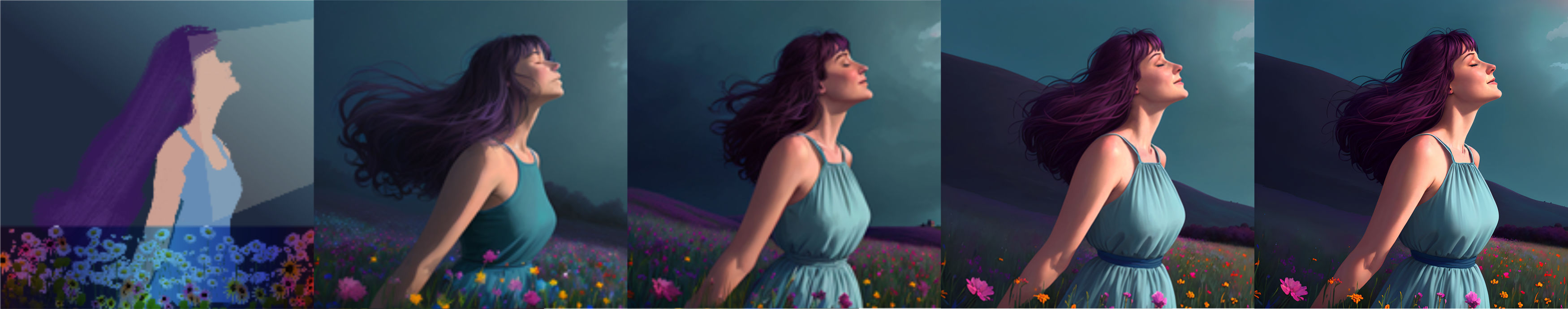
There's a bit of variety, and some adhere more closely to the general prompt than others. I was surprised to see the image in the bottom-left because I didn't have any portrait-related terms in my prompts. That's randomness for you.
I thought, hmm, that's kind of nice. Kind of freaky too; would need some touch-up to make it work. I edited the prompt a bit and got a few variations (and a few mutations).

A Goal
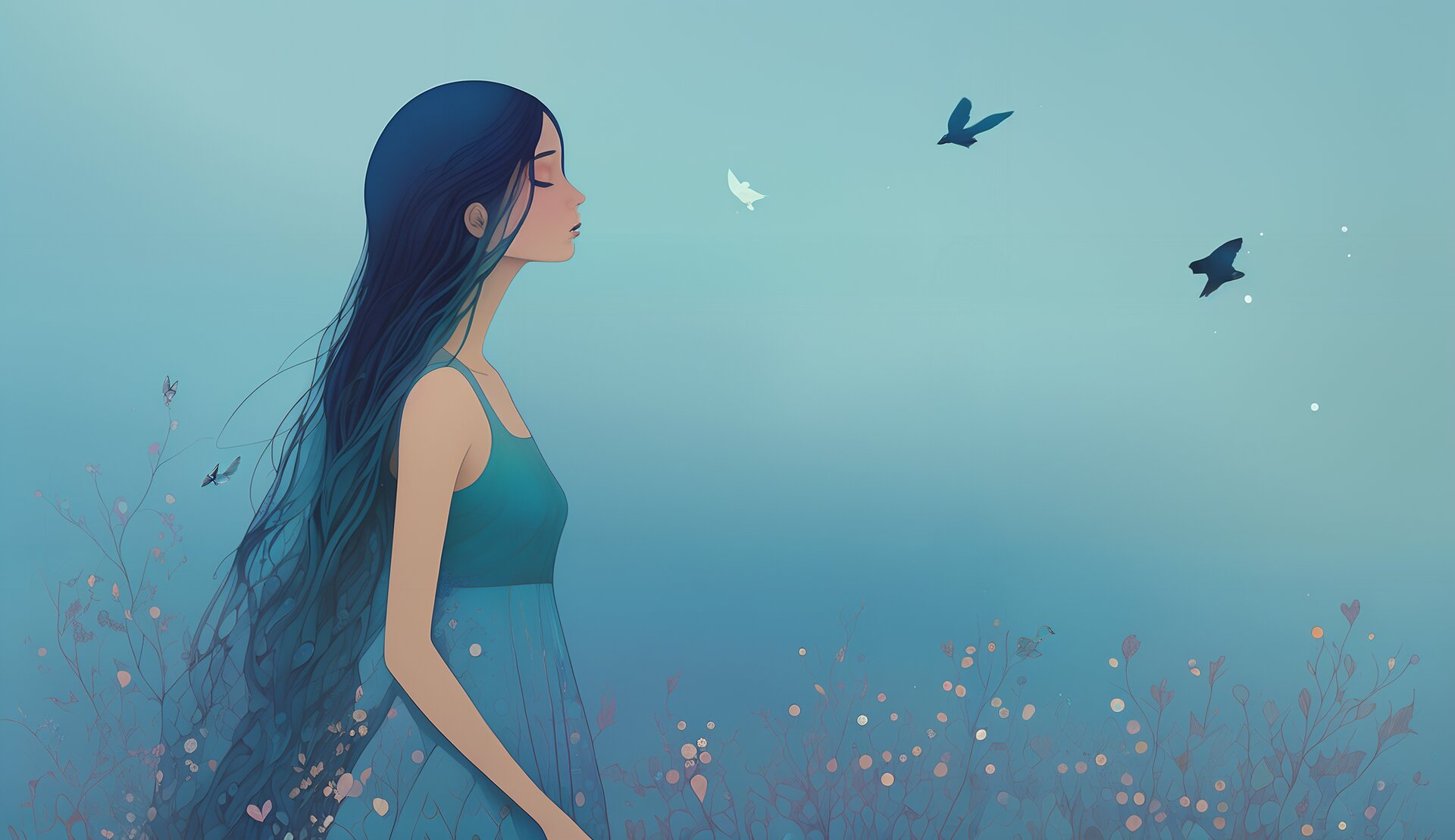
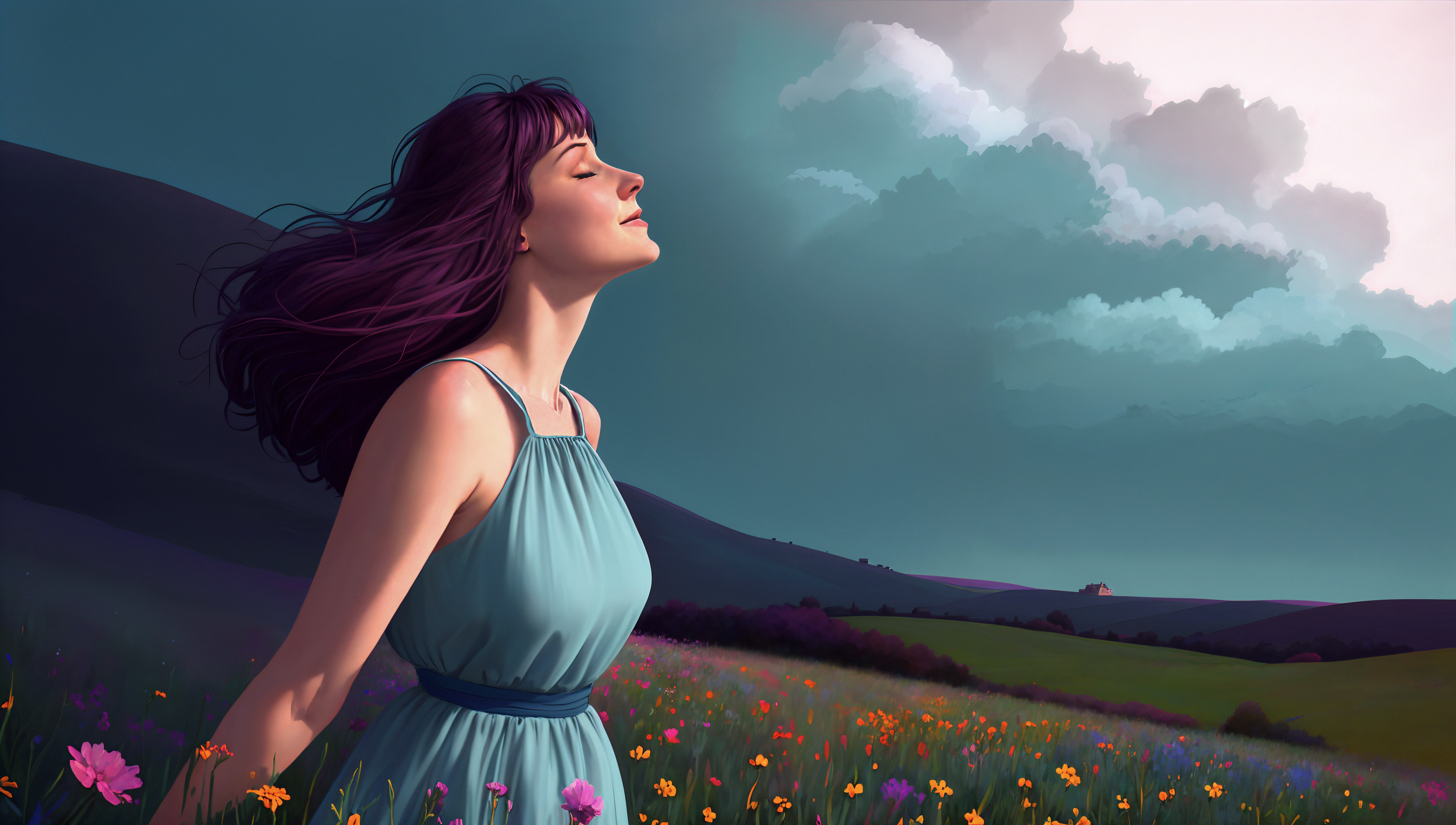
I kept working on it, and then I realized I didn't like it all that much. I let it go for a day and thought about what I really wanted to see. I decided I was looking for a peaceful picture of a woman walking through a wildflower meadow and enjoying the early morning spring sun.
I tried making some prompts that matched what I wanted but couldn't really get there. I had thought I was going down the right path, and got a group of images I was kind of happy with.
As I looked more closely I realized most had the same problem: the lighting was coming from the left, but the woman is looking right. My attempts at controlling the light source were fruitless (although I did learn an interesting technique that may work for other scenes).
Reducing Randomness
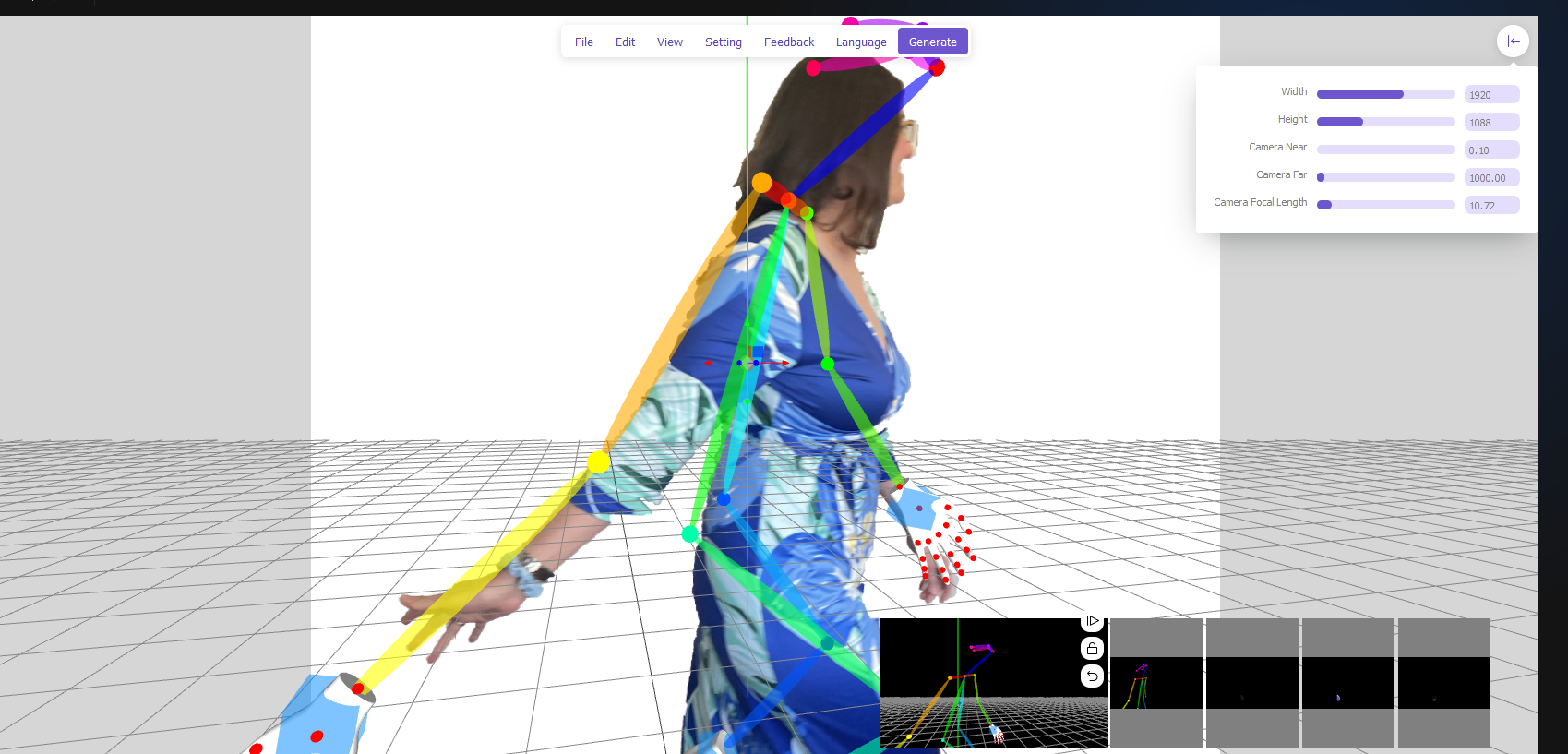
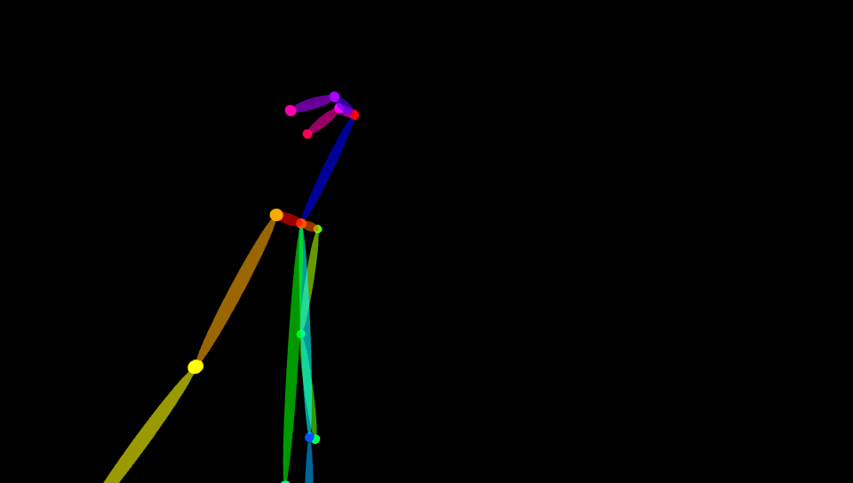
There is a Stable Diffusion extension called ControlNet, which takes in images and tries to figure out how they're put together. It lets you remove some of the process's randomness by showing it how a composition should be put together.
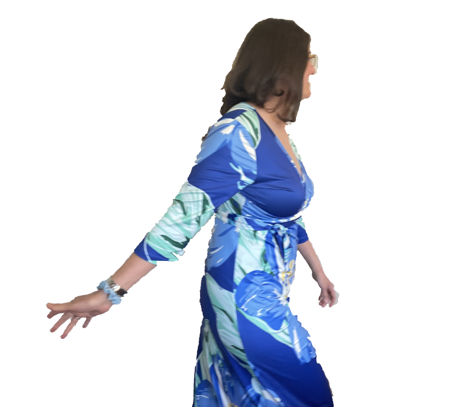
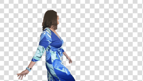
So to make my idea a reality, I asked Jen to model "walking while brushing your hands through the tops of flowers". I pulled her out of the photos and into the Pose Editor, which detected her pose. I did a few rounds of editing the pose and making images until I was happy with the general layout.
I downloaded Krita, a drawing program I had never used before. It took a little while to get used to, because it behaves very similarly but not quite the same as Affinity or Photoshop. It's more of an illustration/painting program, and not so much about retouching pictures.
I used the picture of Jen to get started, then found some free brushes that let me add flowers and grass. I wanted a lot of color, so I, well look at this animated gif so I don't have to explain.
Now I could take my Krita picture and load it into Stable Diffusion along with the ControlNet pose figure. I worked on the prompt and started getting a lot closer to what I wanted. At this point I kept looping to get ever closer to my goal.
- Edit the Krita picture.
- Tweak the prompt.
- Make dozens of variations.
- Sift through the results, toss the real bad ones in the trash, and try to figure out what makes certain pictures work.
- Start at #1 until sleepy.
As I reviewed the thousandth variation, it dawned on me that I was never going to be able to choose the perfect image. It's like being paralyzed by the amount of choices in the cereal aisle, but worse, because I could keep mashing a button to make the aisle go on forever. Imagine a never ending variety of Frosted Flakes and Cheerios. Ugh.
It's a little like digital photography, where you can afford to take 200 pictures each day and throw out the 199 that don't work. But I finally started narrowing it down by making a batch of a two dozen at a time, picking the best one and iterating on it. My professional Color Blue Consultant, Jen, was brought in to give me her opinions on shades of blue (all blues are beautiful, but some are more beautiful than others). Managed to narrow it down to 10, then 3, then 1.
Final Stage: Retouching and Upscaling
So now I have a picture I like. I did a few more iterations with slight tweaks, then brought the best one into Affinity for retouching, just like I would a photo. Then I'd send it back to Stable Diffusion, check the results, and repeat. After a whole bunch of this I upscaled it to 1080P, then 4K. I'm very happy with the results, and I enjoyed the journey too.
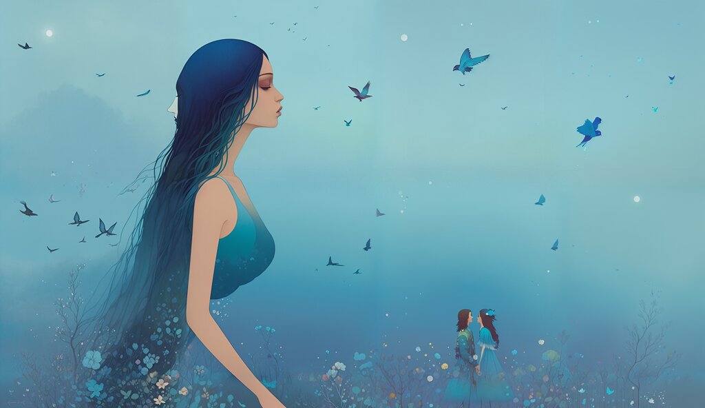
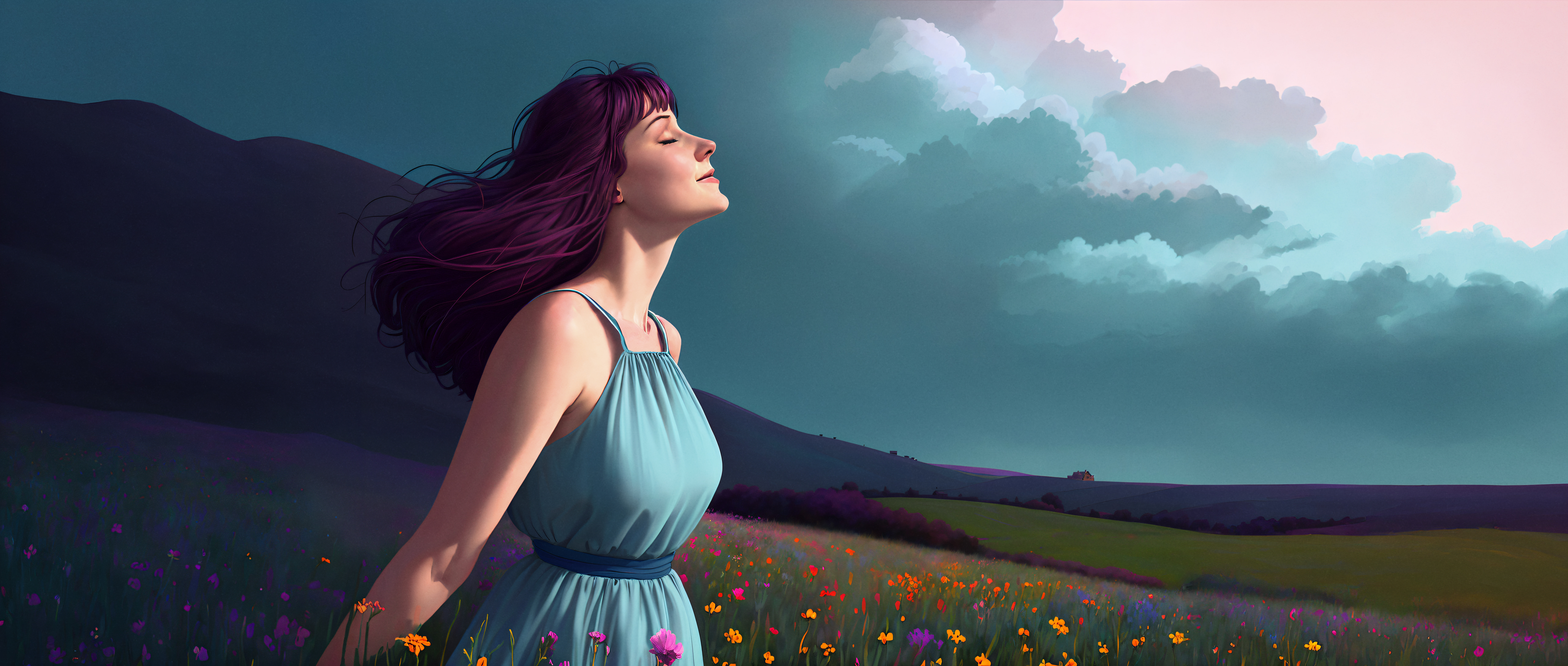
Update: Widescreen
I made a widescreen (21:9) version too. Here's links to both the full resolution versions of both:
Comments